[pt]
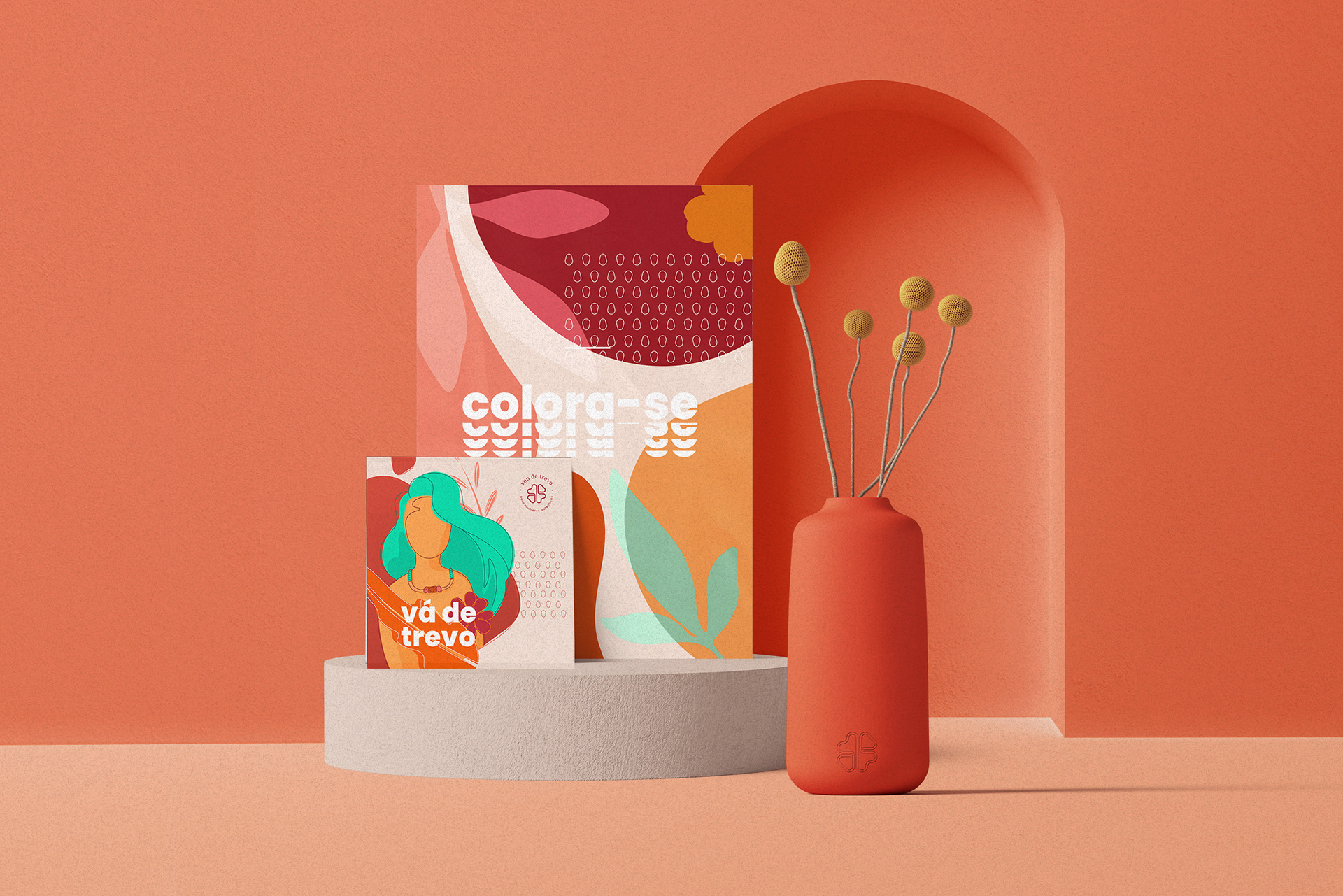
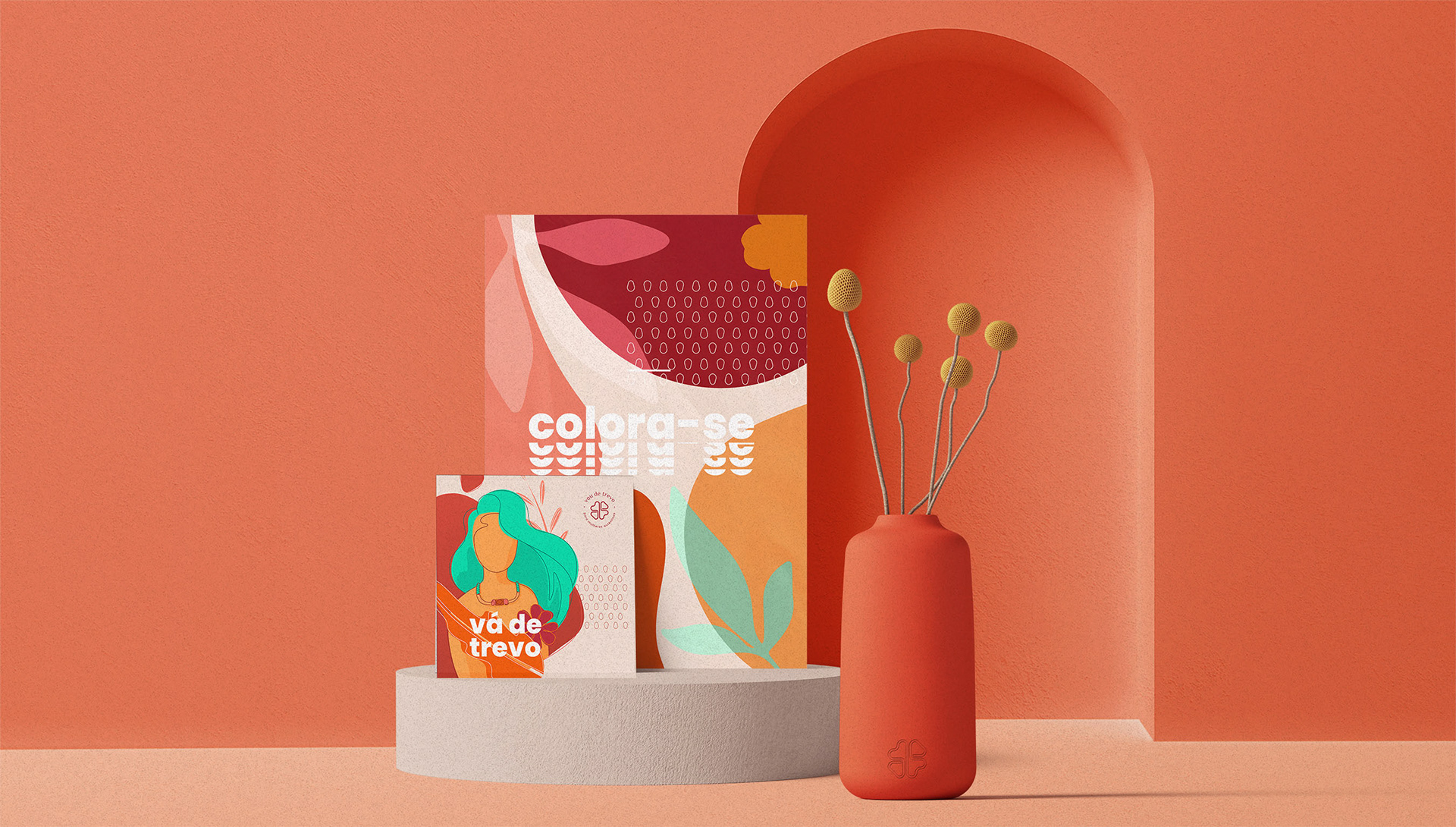
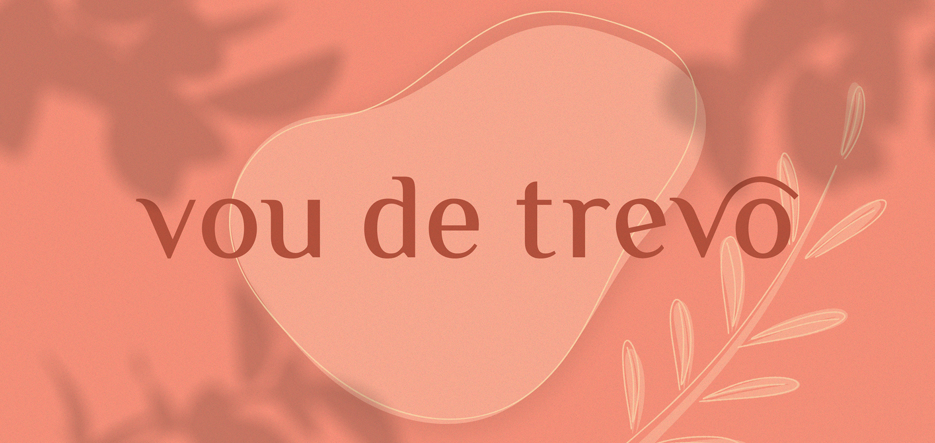
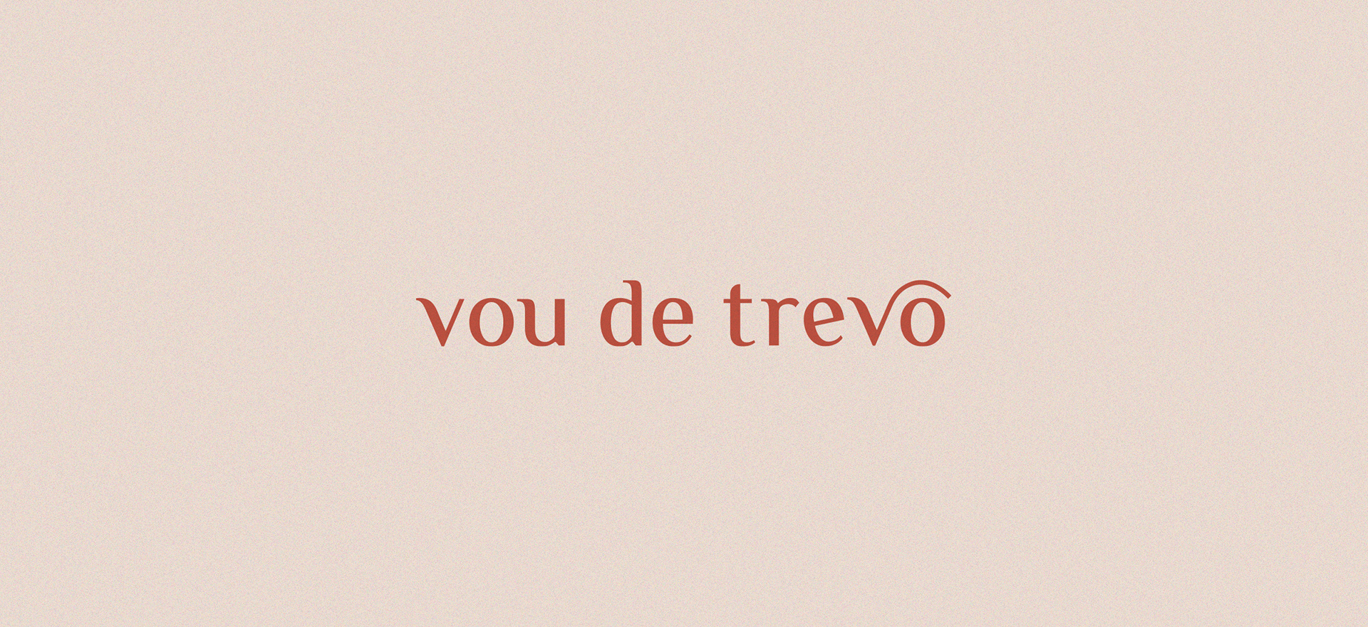
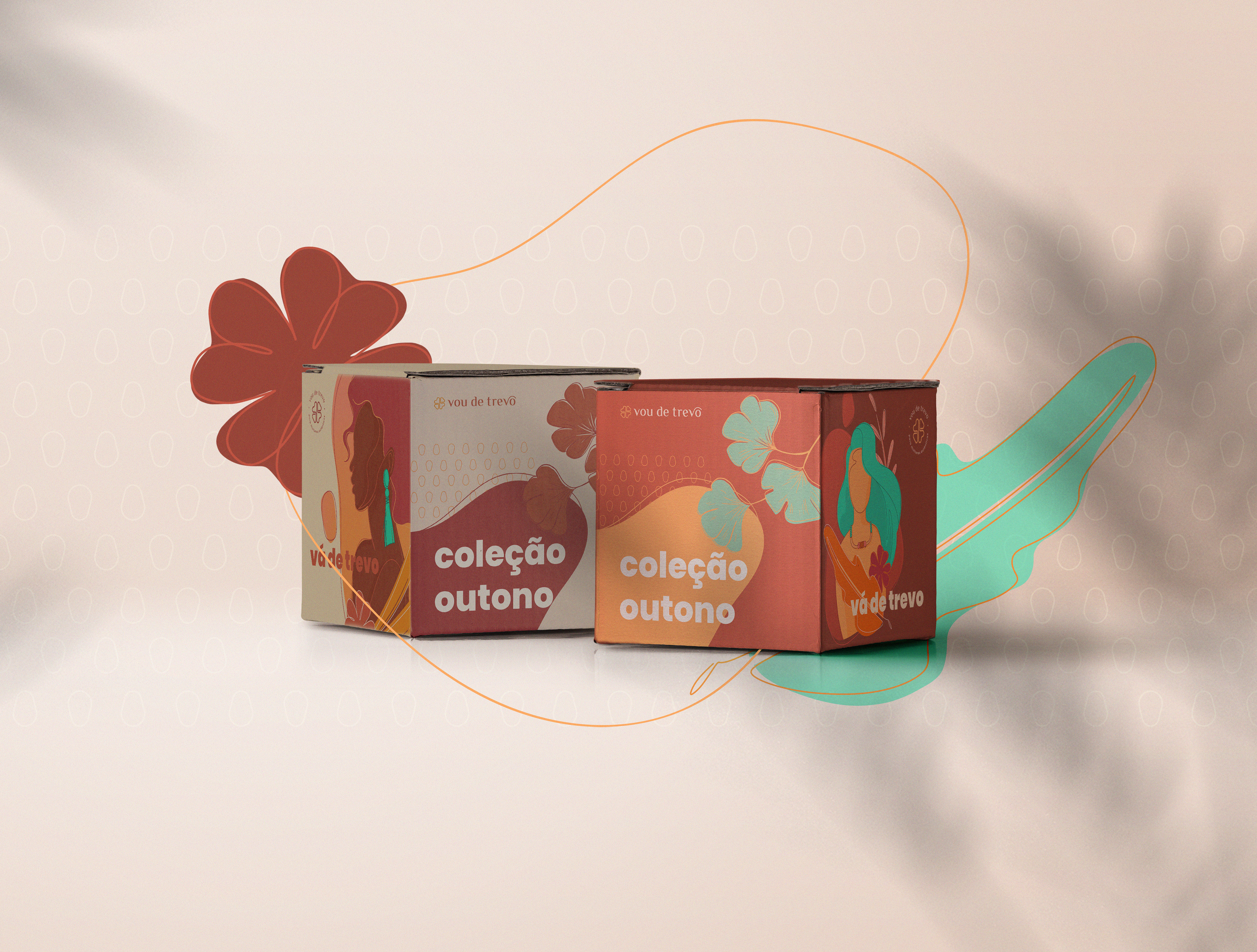
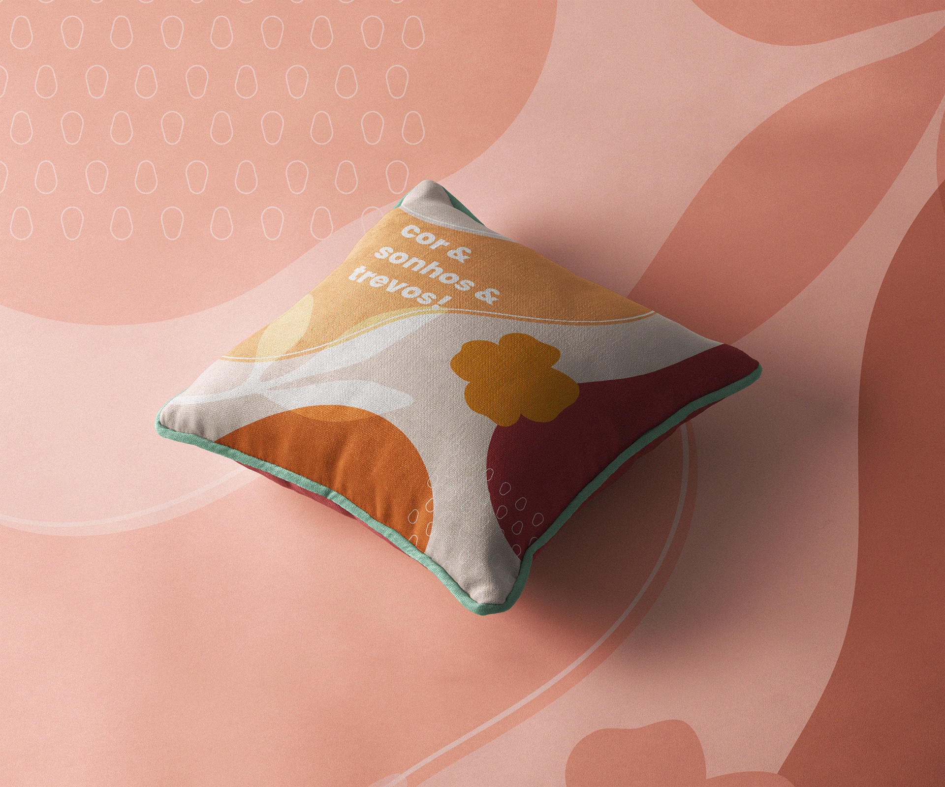
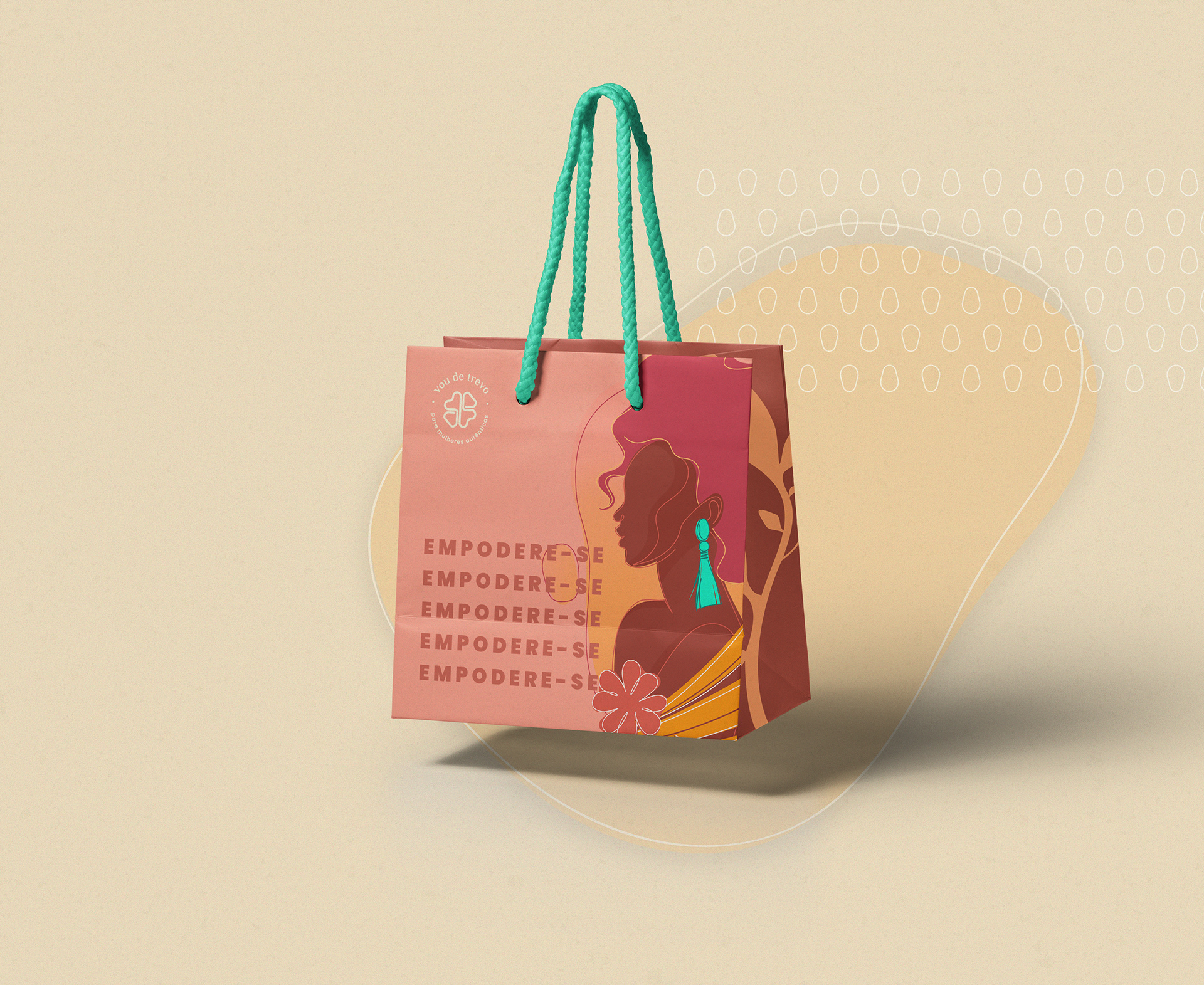
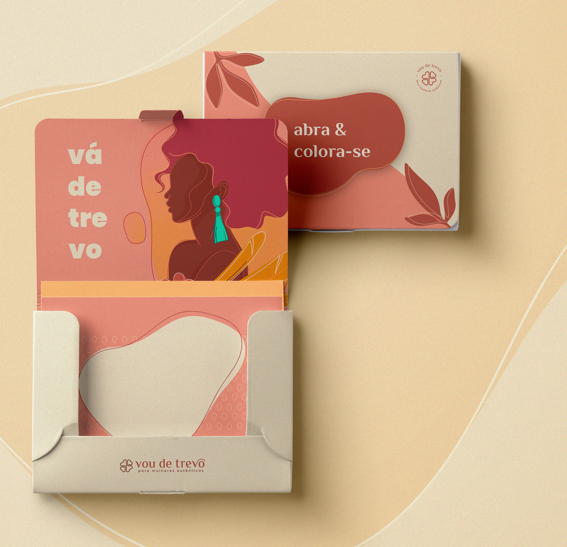
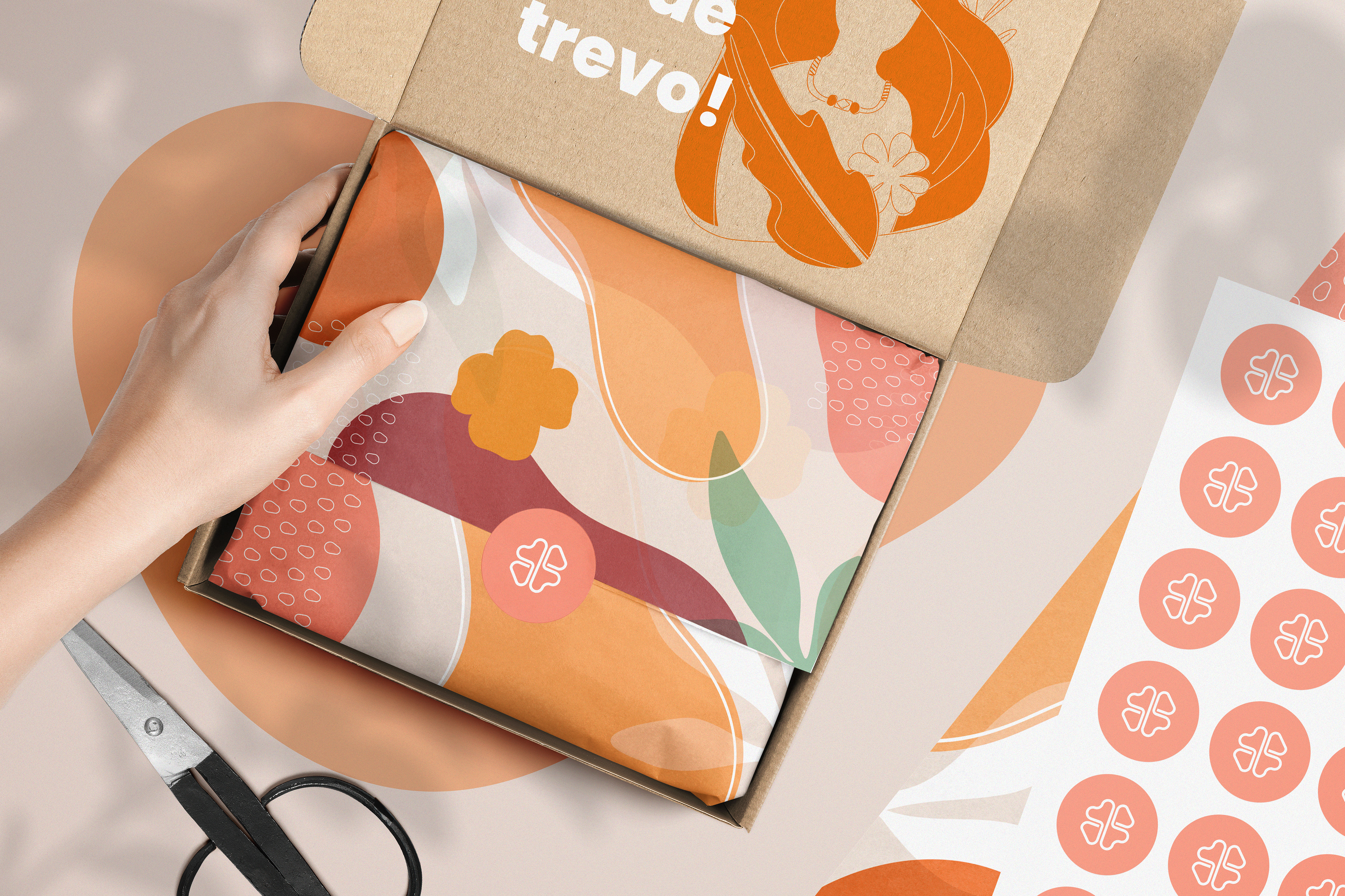
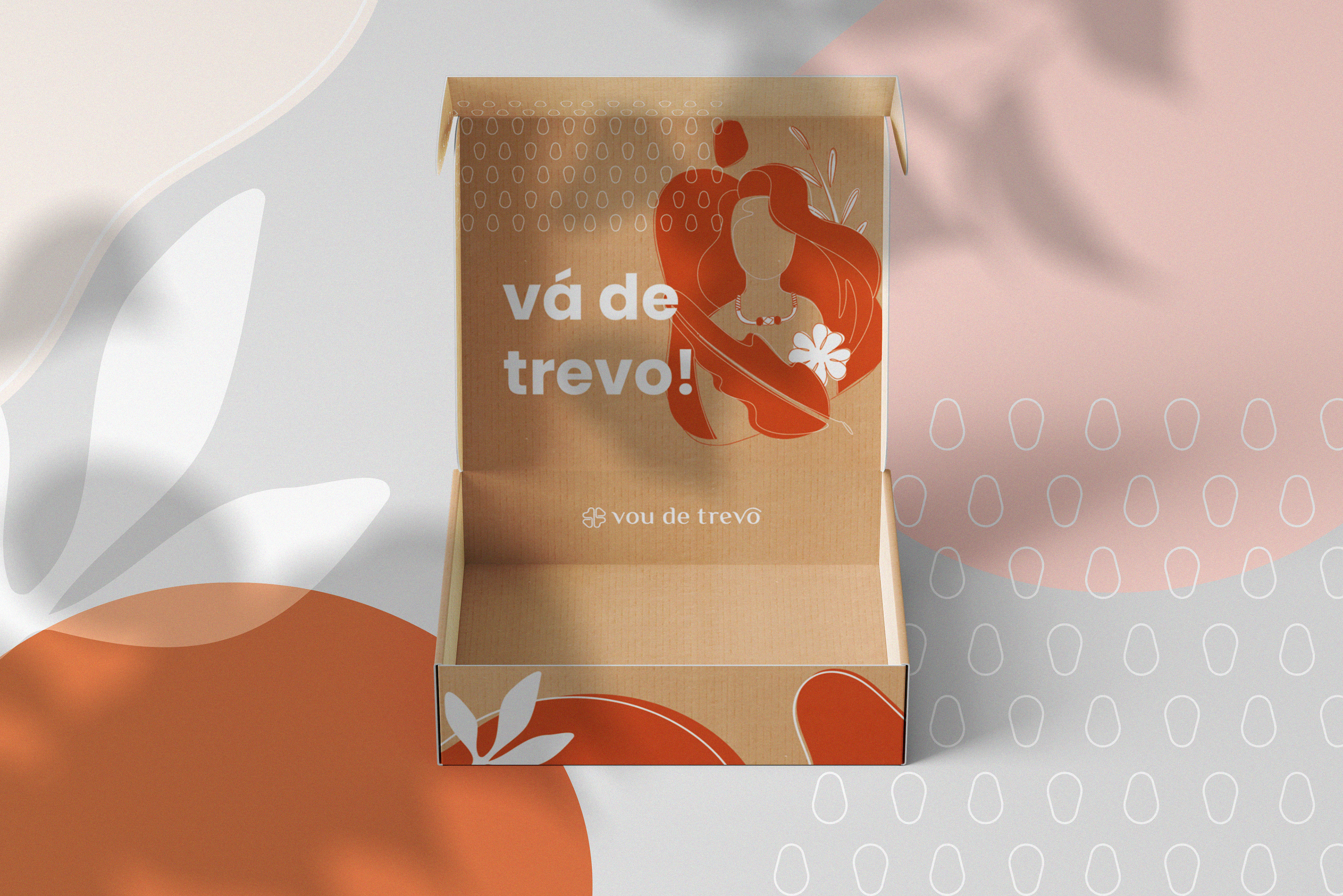
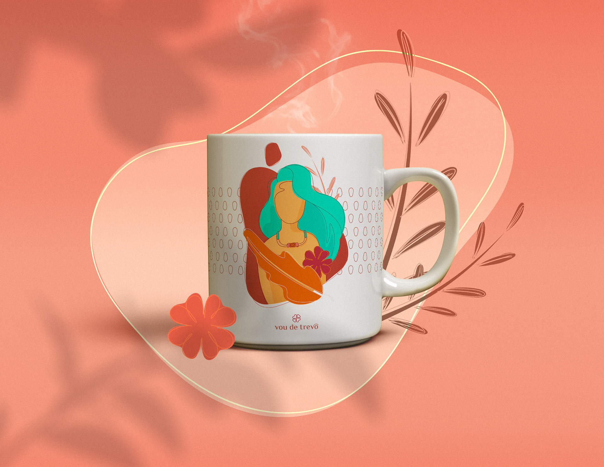
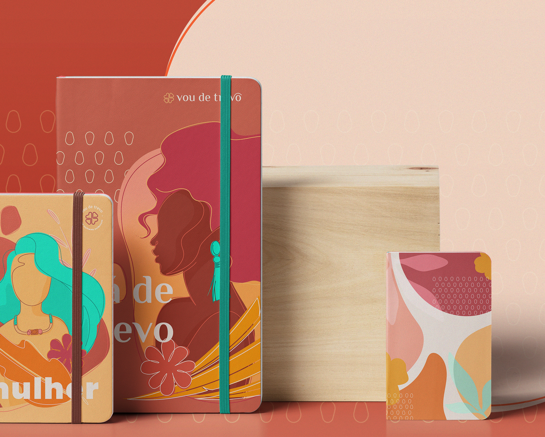
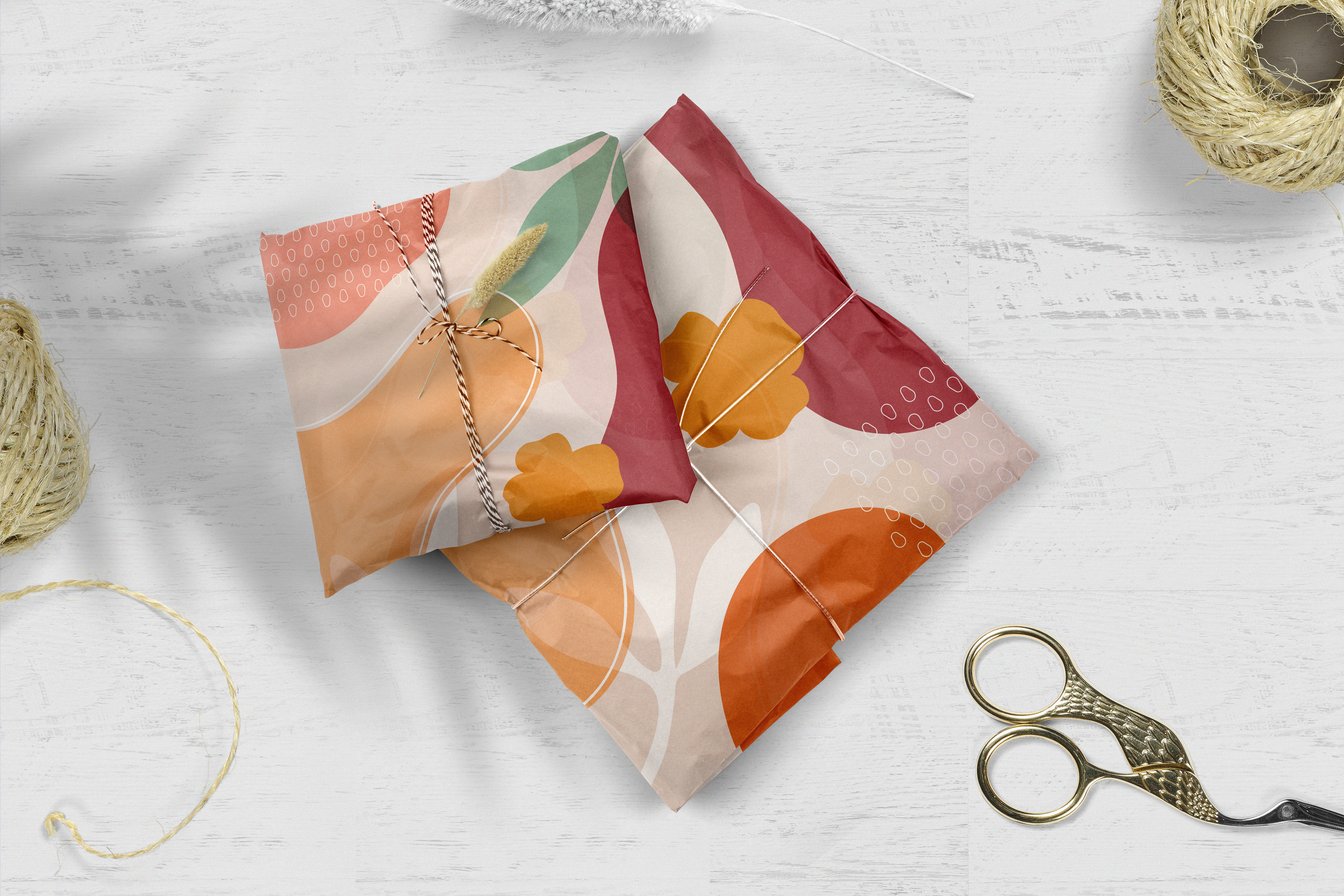
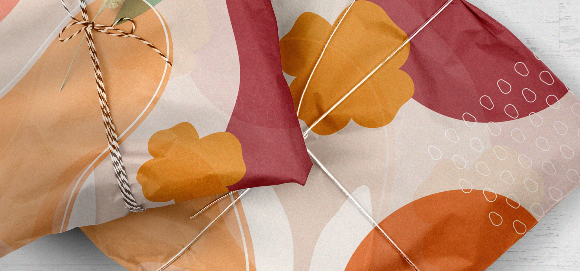
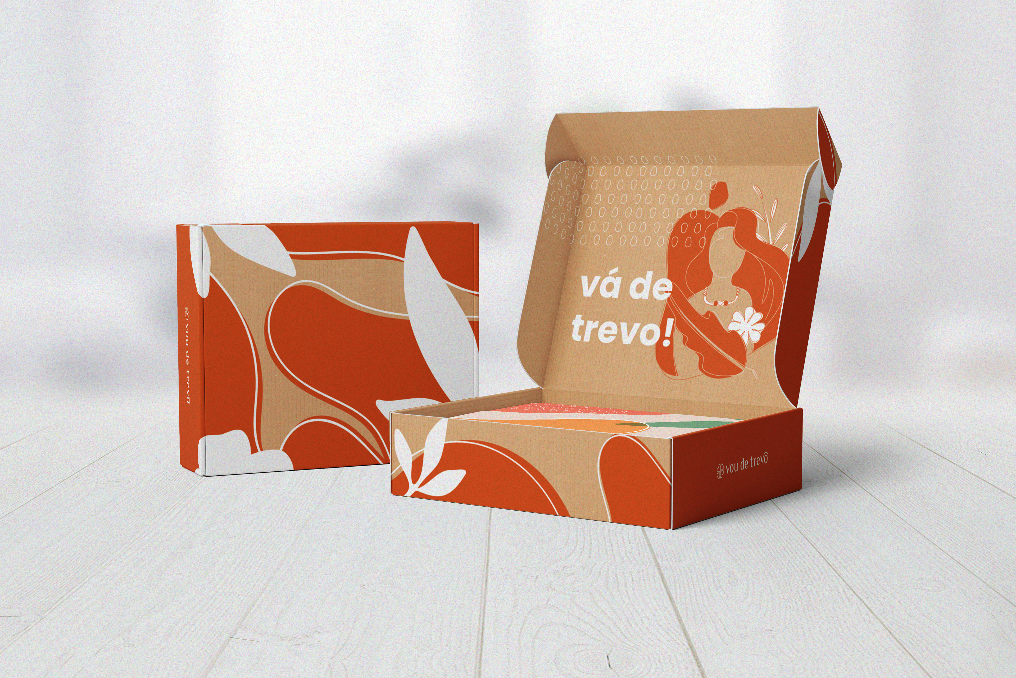
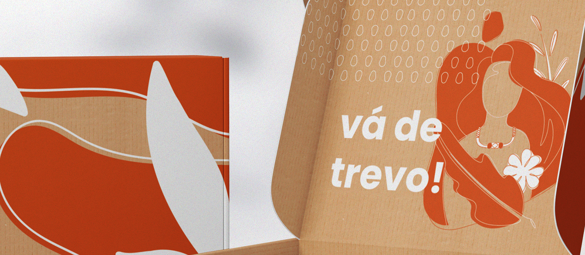
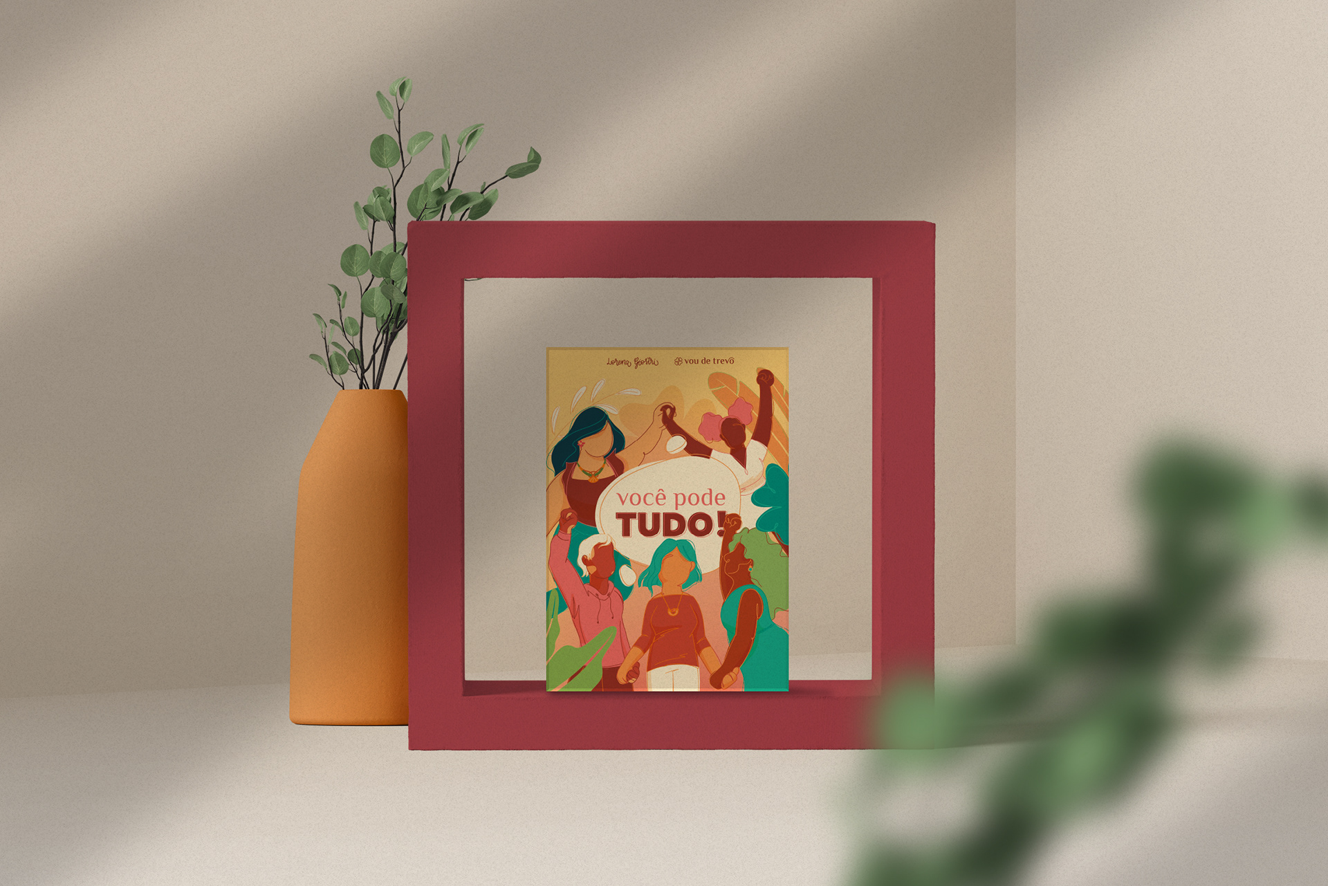
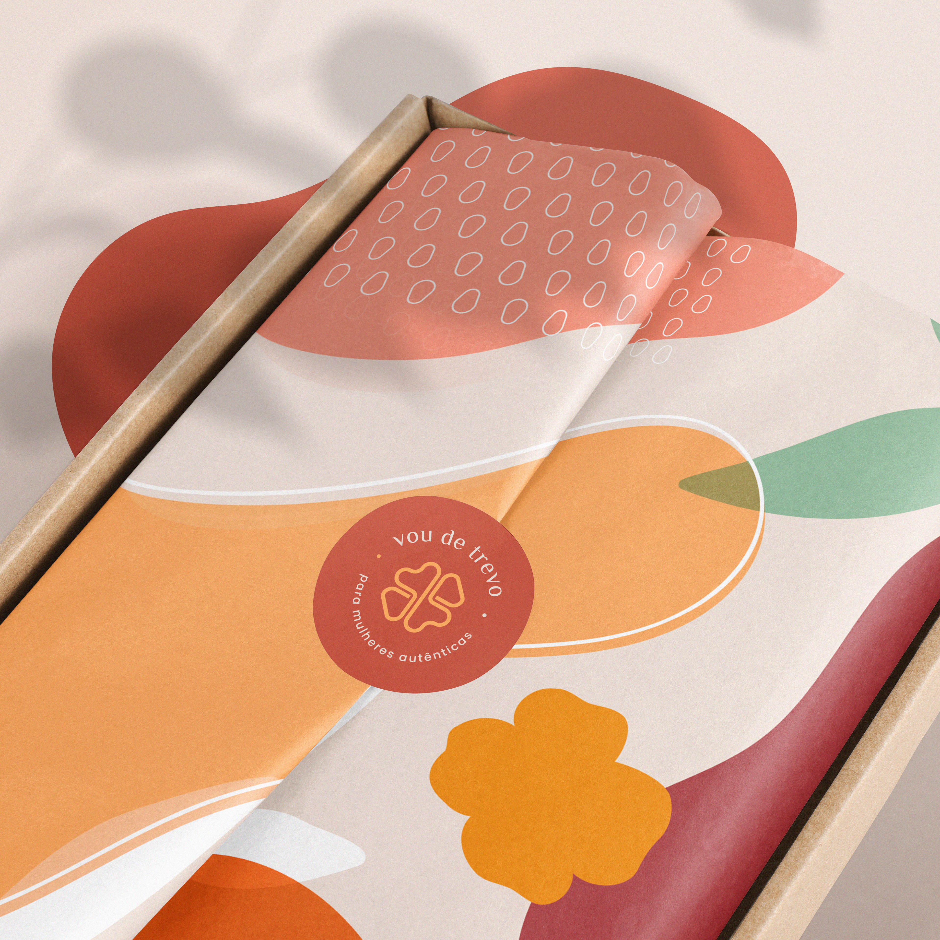
A Vou de Trevo é uma marca que vai além de projetos de bijuterias autênticos e marcantes. Ela produz trevos que empoderam mulheres, colorem suas vidas e ajudam a expressar a força de ser mulher através de suas peças. É uma produção íntima, intuitiva, inteligente e artesanal de sentimentos positivos, onde empacotam alegria e despertam essências. Este foi um Projeto de Marca com foco em Branding, envolvendo posicionamento, estratégia, Identidade Emocional e Identidade Visual.
[en]
Vou de Trevo is a brand that goes beyond authentic and striking jewelry projects. They produces shamrocks that empower women, color their lives and help express the strength of being a woman through her pieces. It is an intimate, intuitive, intelligent and handmade production of positive feelings, where they pack joy and awaken essences. This was a Brand Project focused on Branding, involving positioning, strategy, Emotional Identity and Visual Identity.
Durante a reunião de Mapa de Empatia entendemos que ressignificar o uso das bijuterias no contexto que estamos vivendo (pandemia global) ajuda a trazer autoestima, expressão e vida, mesmo que no ambiente online. Ela abraça a pluralidade e diversidade das mulheres em todas as formas, tamanhos, cores e tipos e realça a beleza já existente de cada uma. A bijuteria carrega uma comunicação intrapessoal, conversamos com nós mesmas e tangibilizamos nossa história e força através do que nos representa.
During the Empathy Map meeting, we understood that giving new meaning to the use of jewelry in the context we are living in (global pandemic) helps to bring self-esteem, expression and life, even in the online environment. It embraces the plurality and diversity of women in all shapes, sizes, colors and types and highlights the beauty that already exists in each one. Jewelry carries intrapersonal communication, we talk to ourselves and make our history and strength tangible through what represents us.
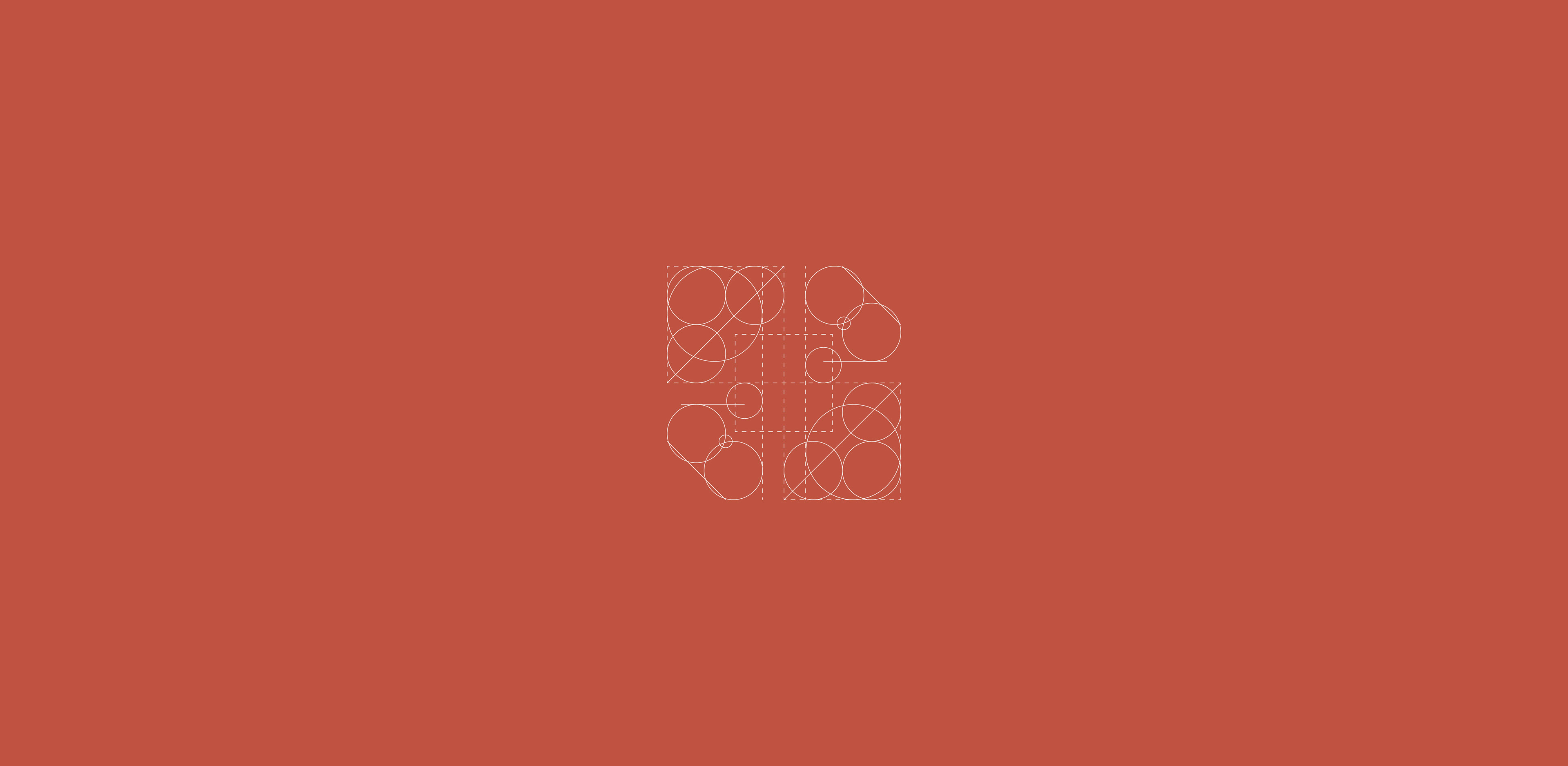
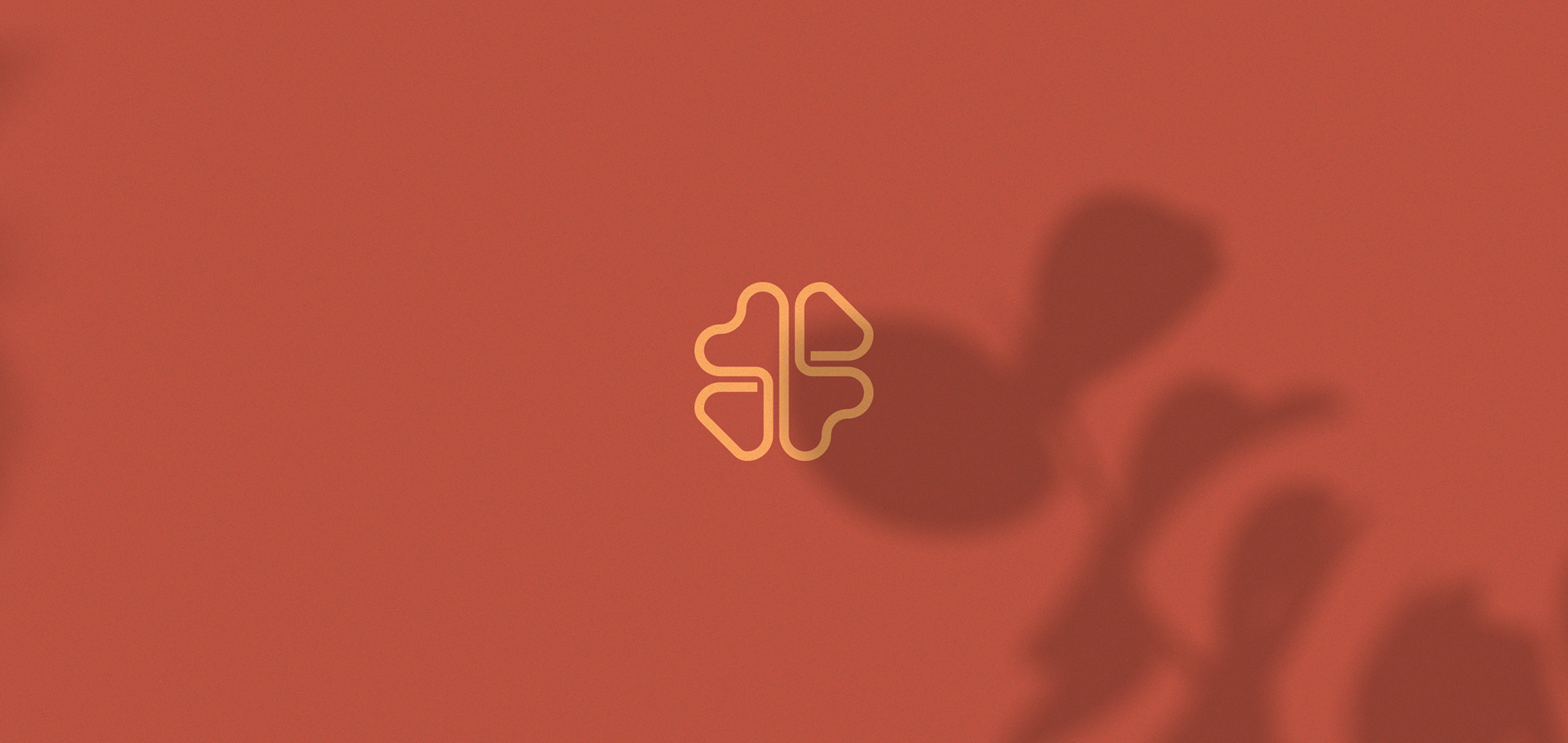
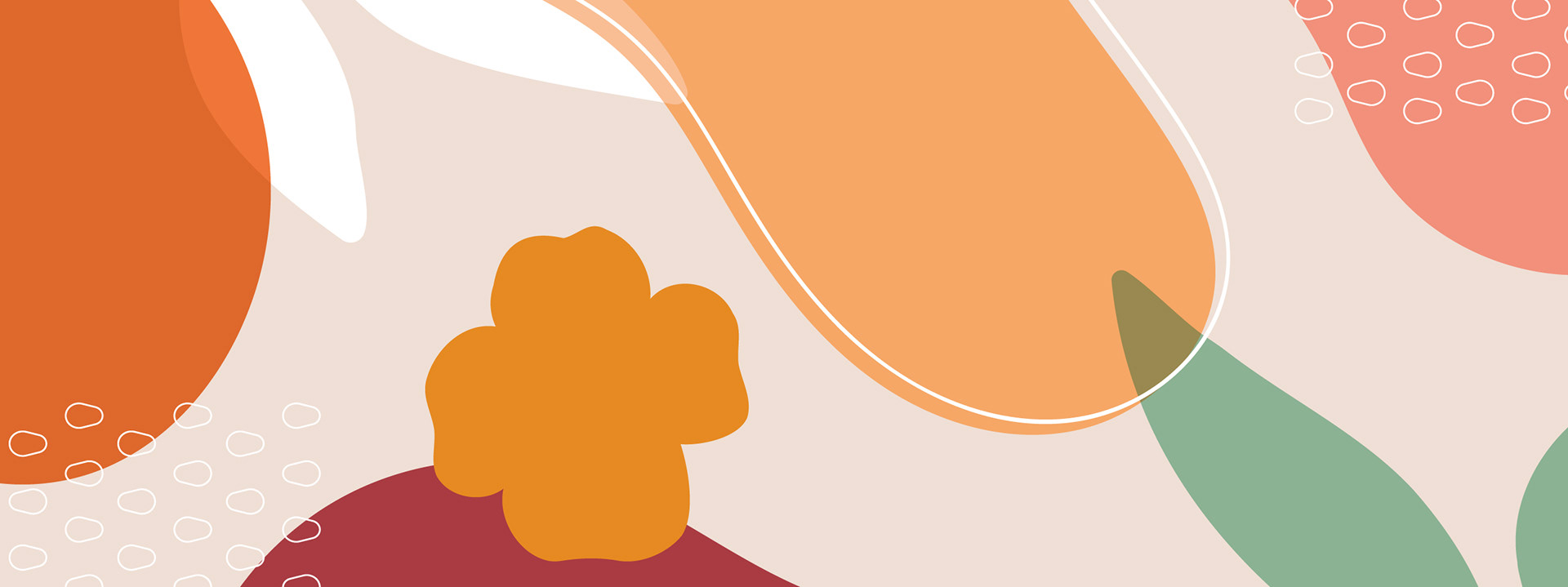
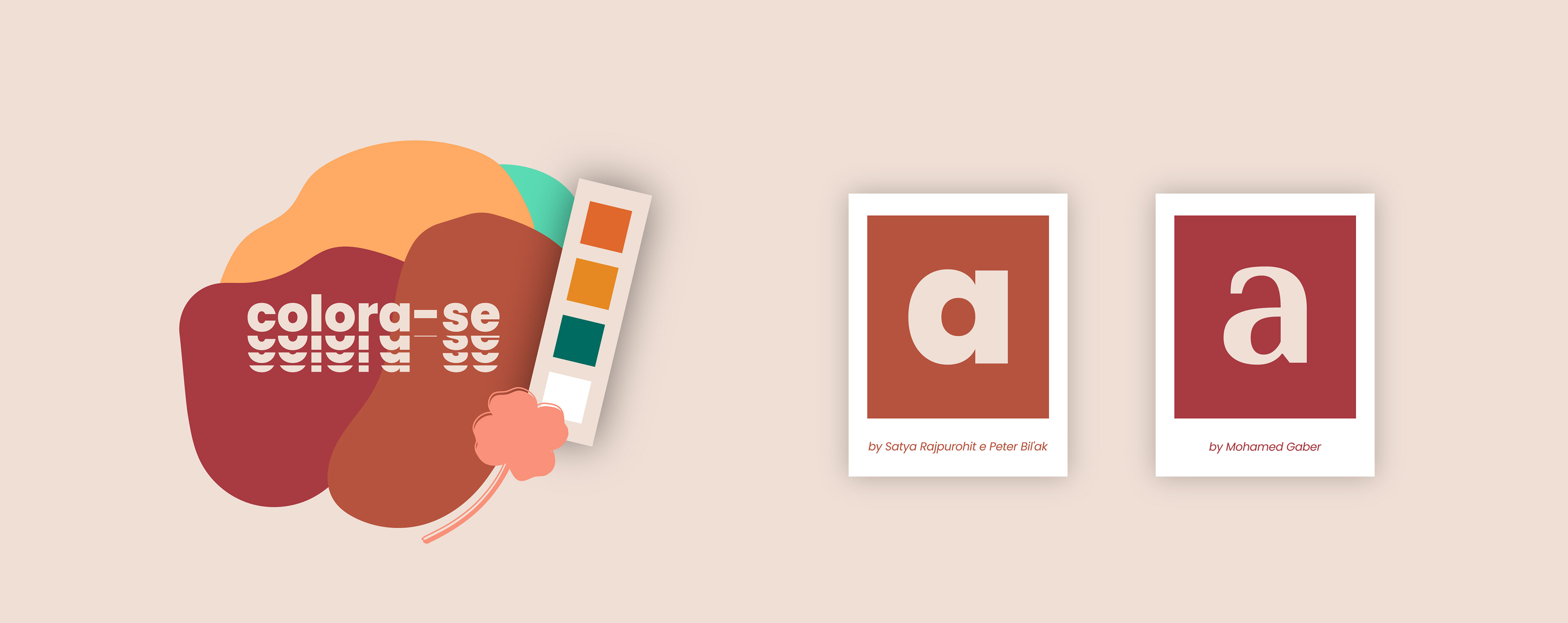
A simbologia do Trevo através da construção das formas:
- Folhas diferentes para trazer o conceito de pluralidade, mas que também traz simetria.
- 4 folhas: trevo da sorte, 4 mulheres que são os pilares da marca e as 4 estações do ano para as coleções.
- Continuidade e fluidez / ruptura, para fazer alusão ao propósito do feminismo para as mulheres.
- O símbolo foi projetado a partir da proporção áurea, para trazer harmonia às formas.
The symbolism of the Clover through the construction of forms:
- Different leaves to bring the concept of plurality, but that also brings symmetry.
- 4 leaves: lucky clover, 4 women who are the pillars of the brand and the 4 seasons for collections.
- Continuity and fluidity / rupture, to allude to the purpose of feminism for women.
- The symbol was designed from the golden ratio, to bring harmony to the shapes.
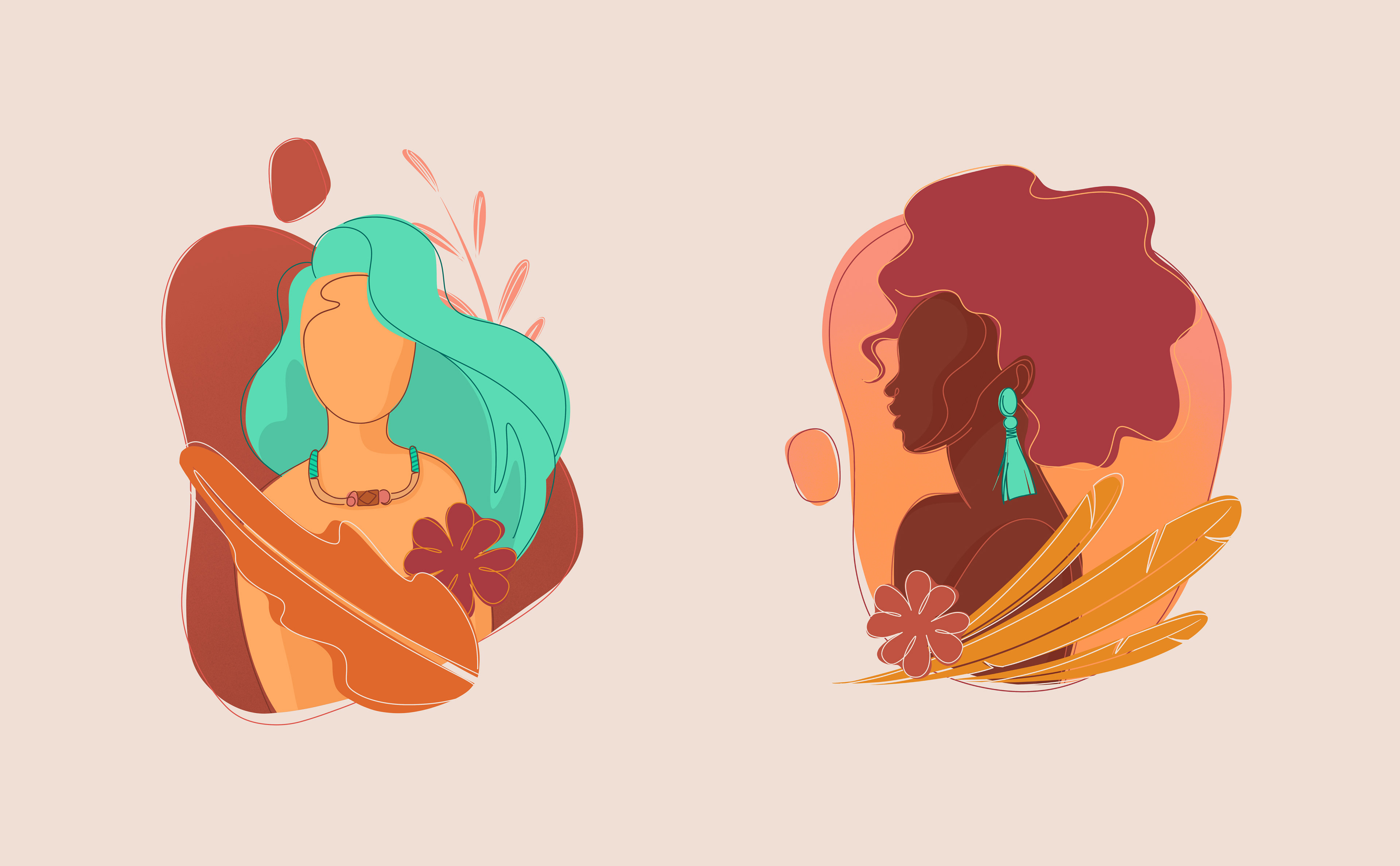
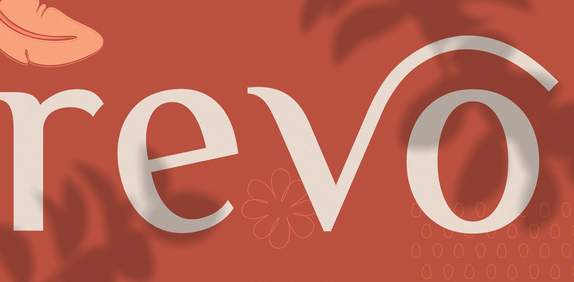
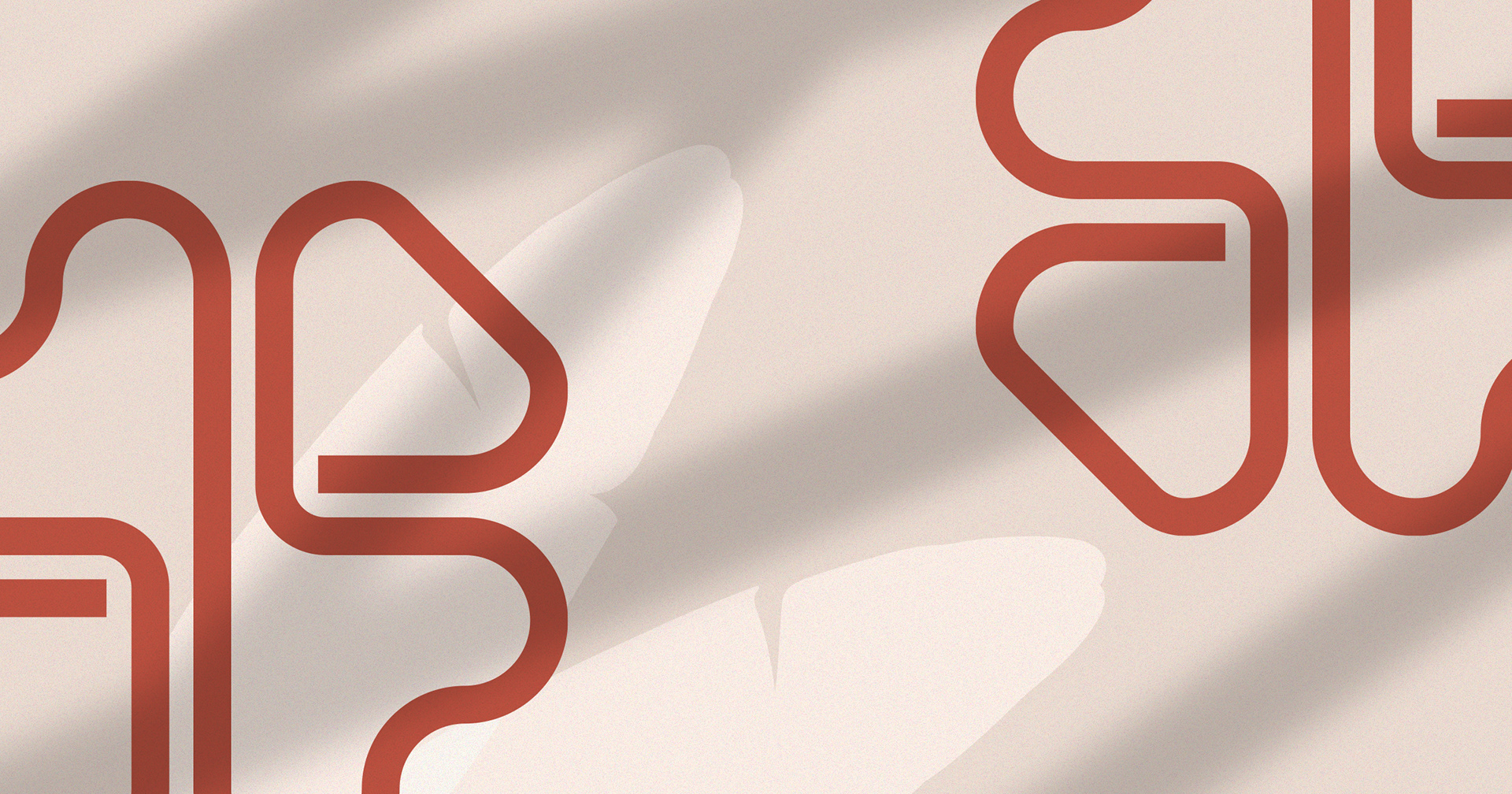
Ilustration by Lorena Giostri
Projetado através do Design Thinking, Design Emocional e Design Positivo.
Designed through Design Thinking, Emotional Design and Positive Design.