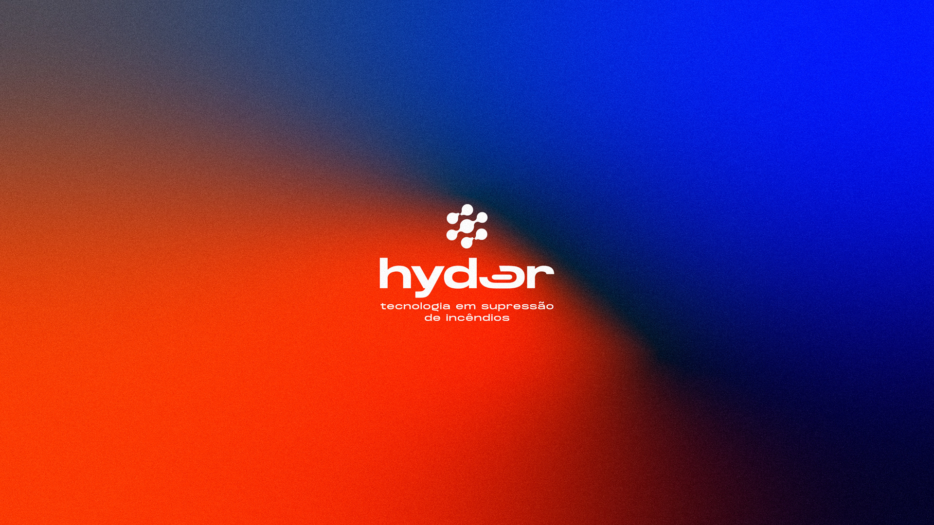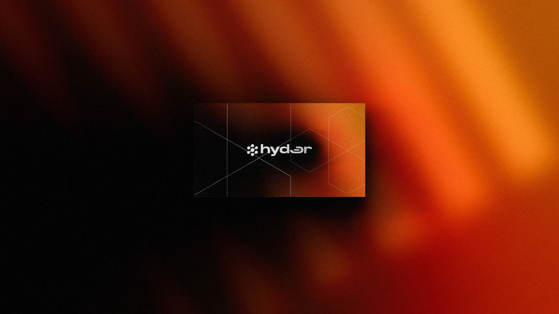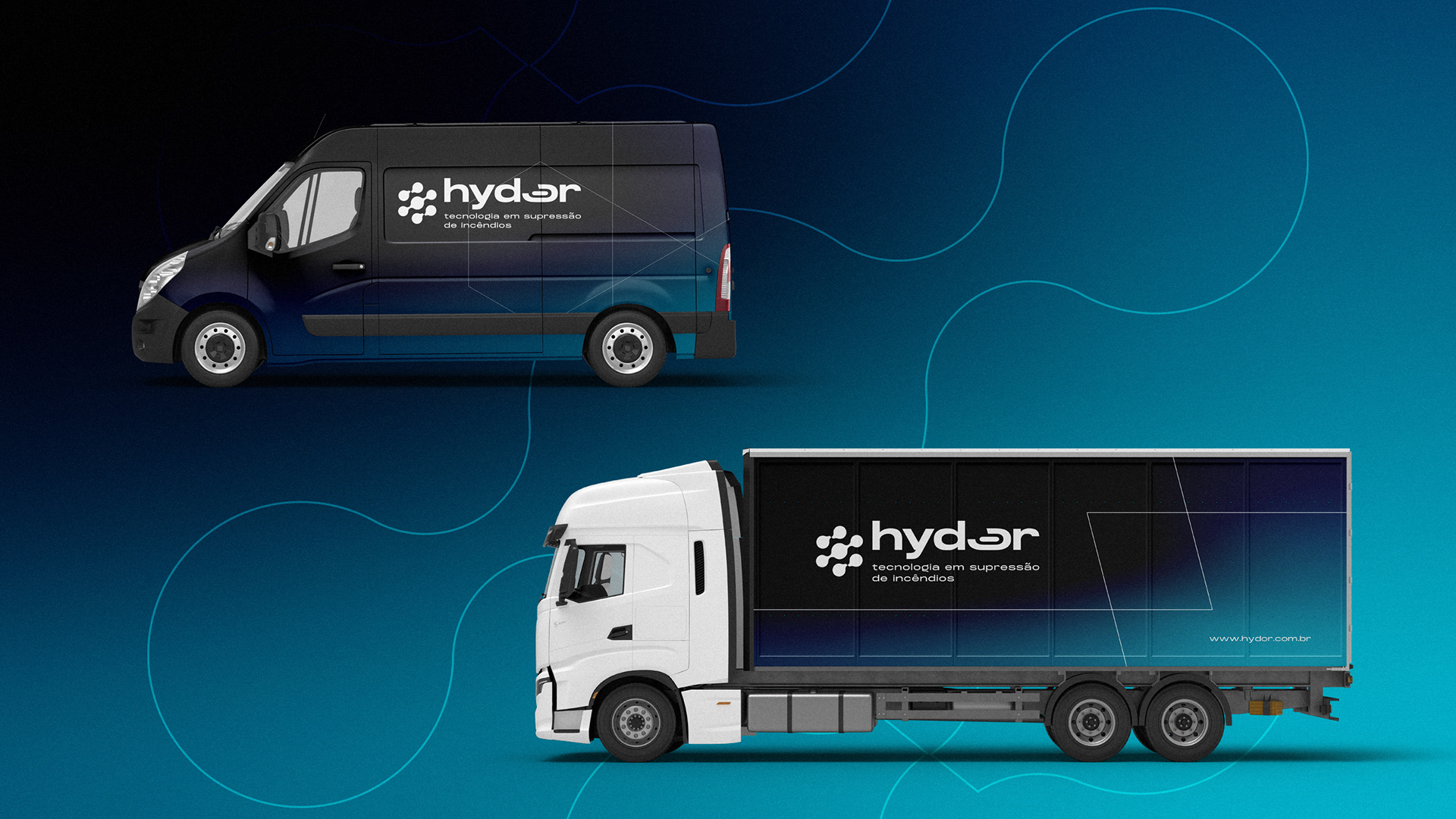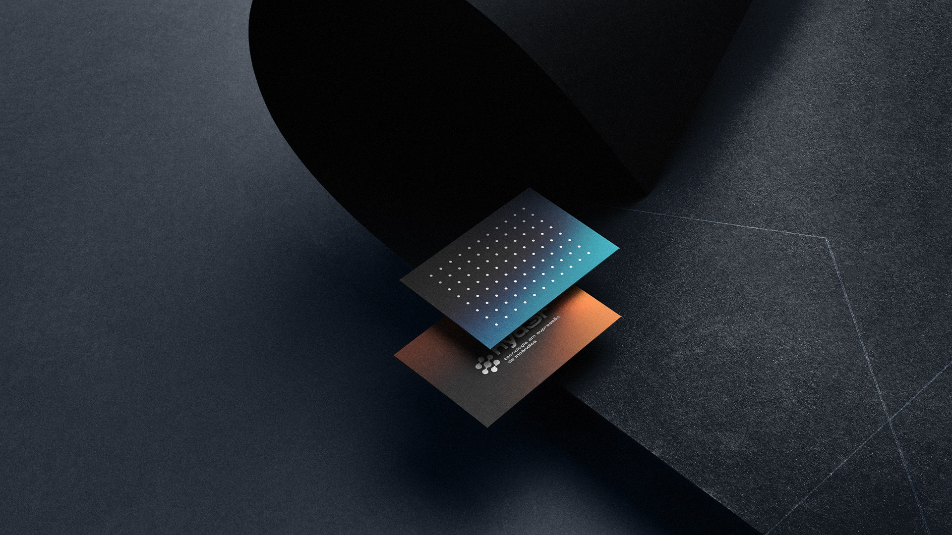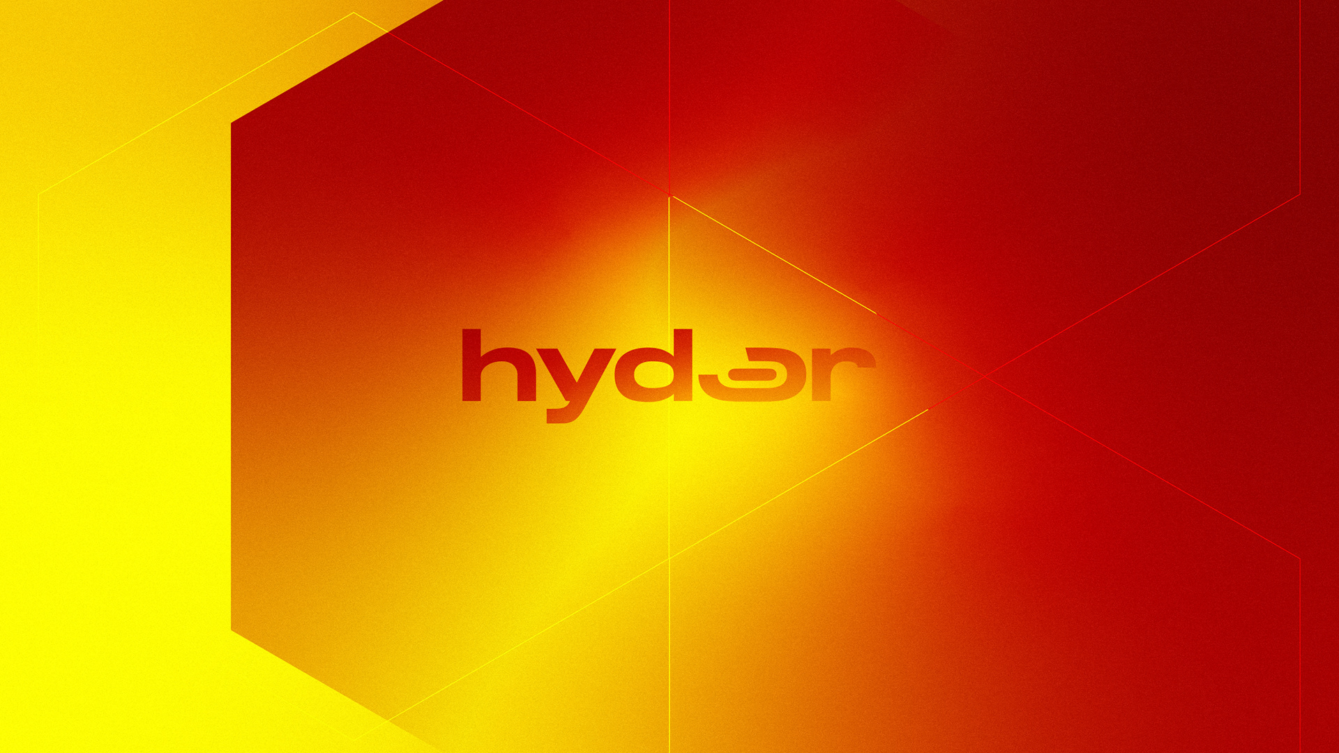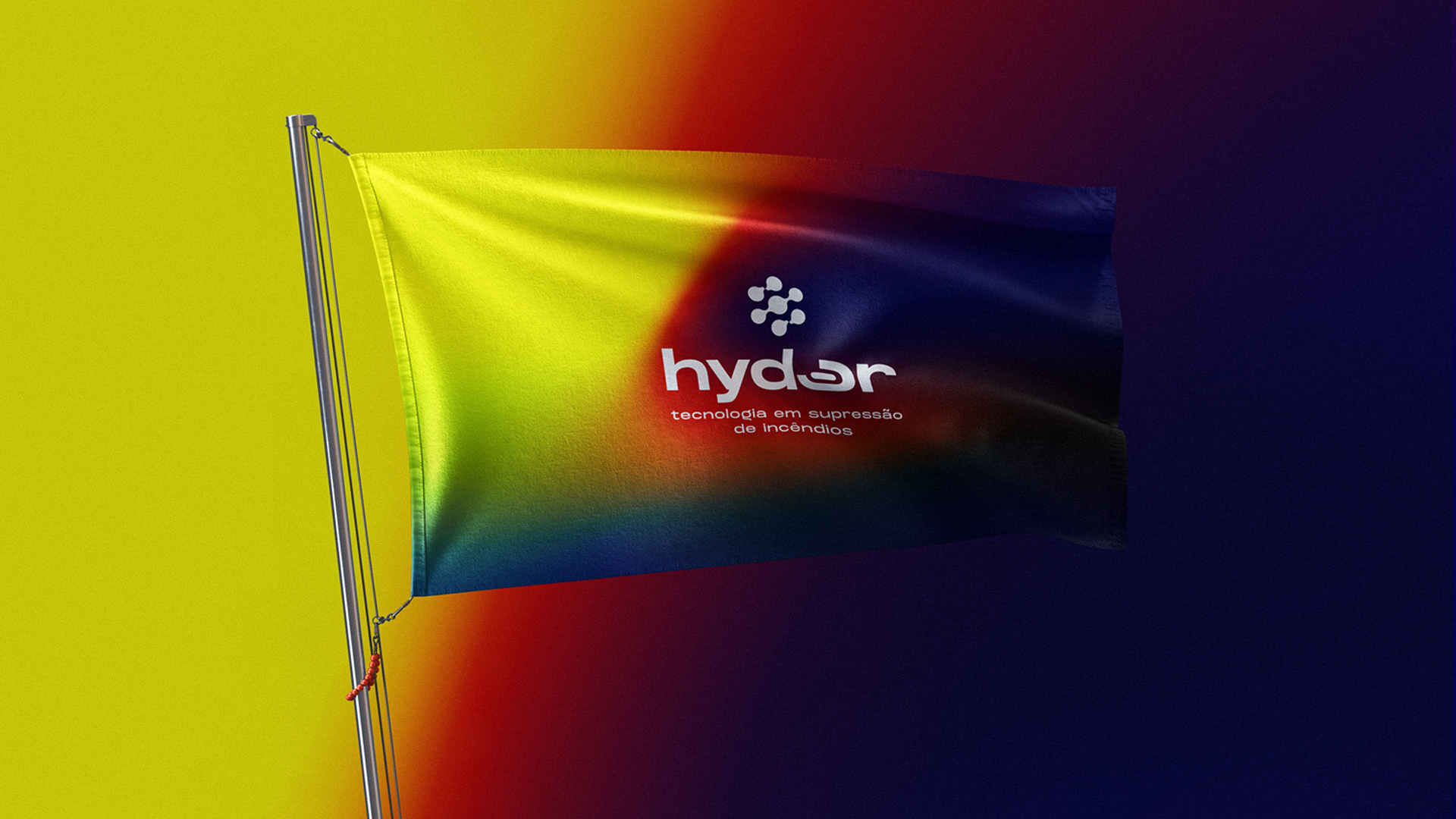
Hydor - Tecnologia em Supressão em Incêndios.
Projeto de Marca com foco em Branding envolvendo estratégia e identidade visual.
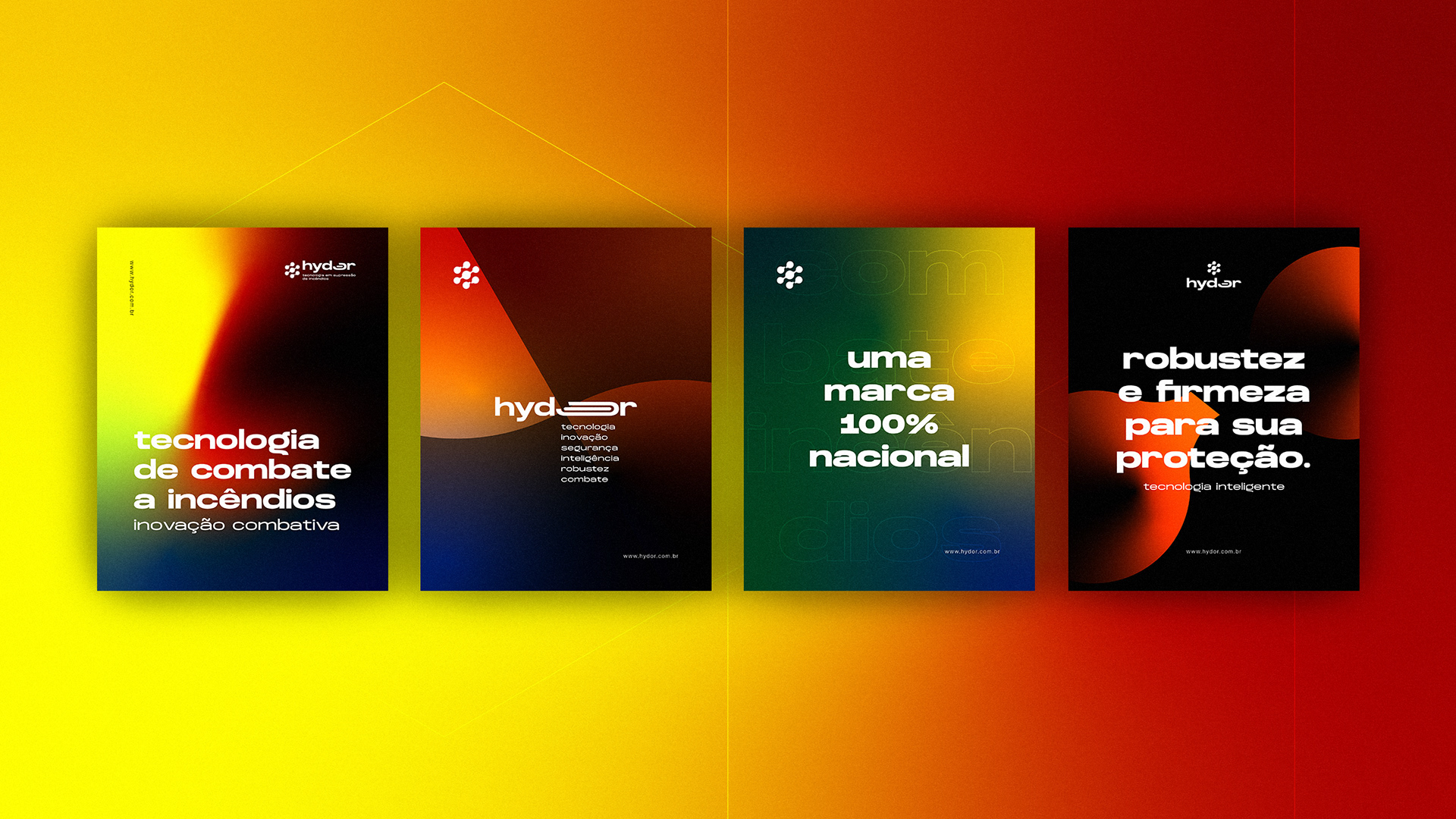
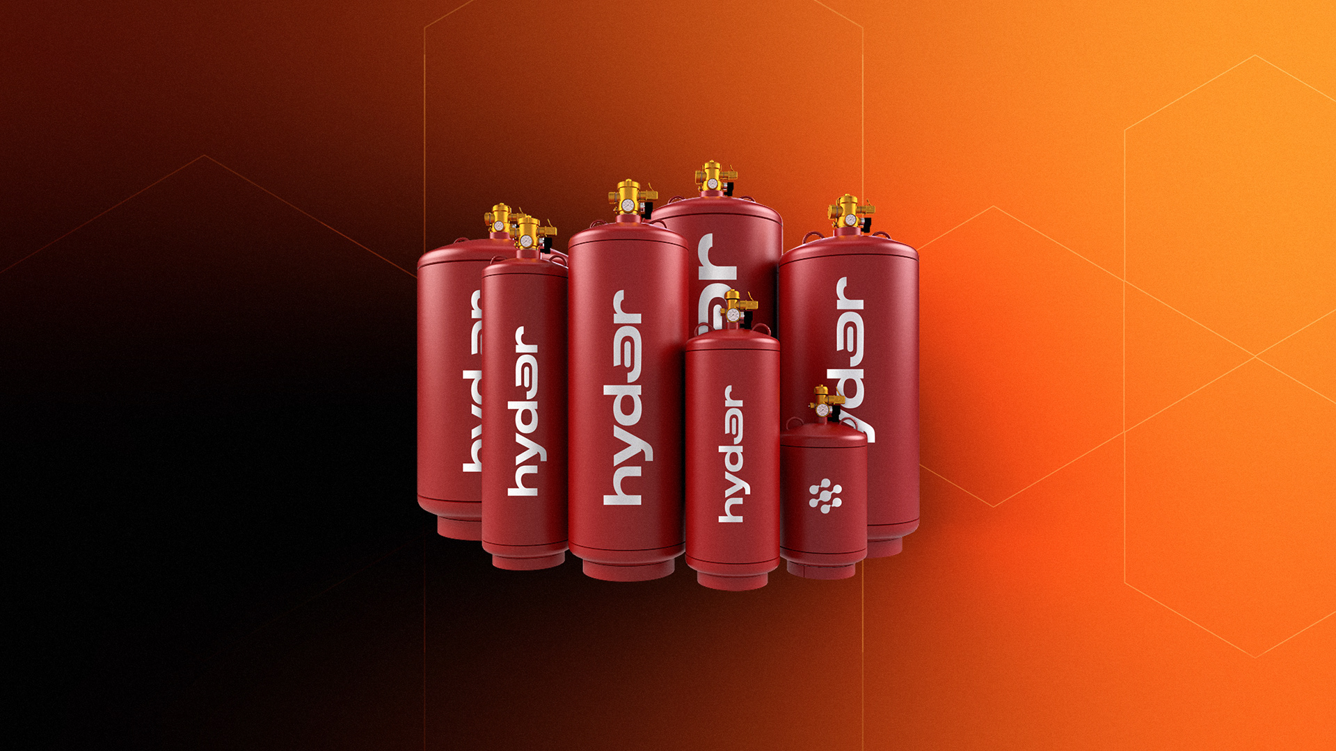
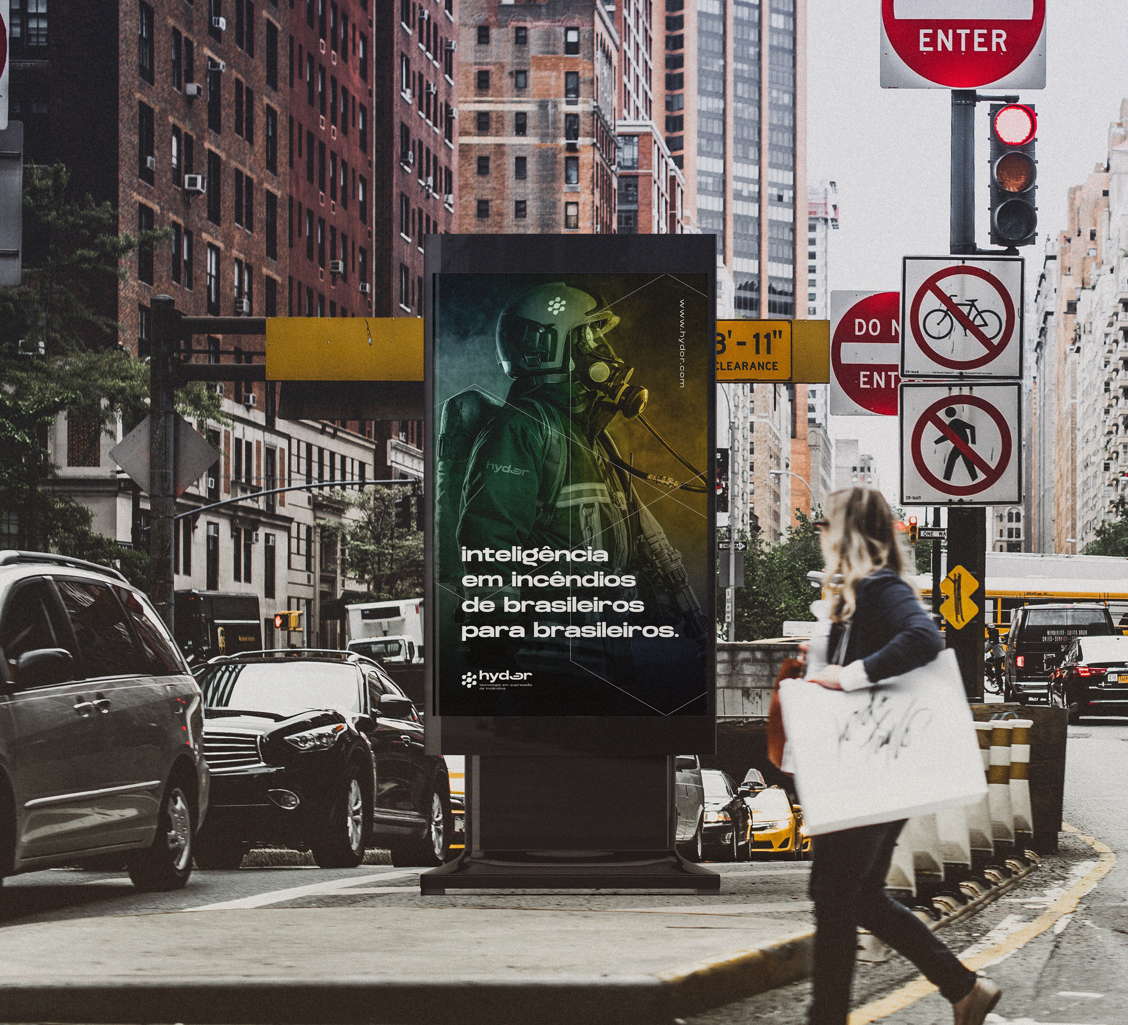
O projeto de marca foi desenvolvido para uma empresa brasileira nova com inovação em tecnologias de supressão de incêndios, buscando constantemente uma diferenciação inteligente perante as antigas gigantes do mercado, trazendo também uma logística reversa forte, valorização dos nossos recursos naturais e produtos limpos e não nocivos em sua gama de produtos.
Hydor vem do grego antigo ‘υδωρ e significa água (fonética ‘idór’). Hydor é o radical da palavra hidro (hydro), vastamente conhecida na engenharia e radical de mais de 700 palavras da língua portuguesa, relacionadas à água.
Água é um dos recursos naturais mais preciosos que temos, devido a sua abundância não valorizado da forma correta pela humanidade e altamente desperdiçado. Água é fonte da vida e o principal agente extintor encontrado na natureza.
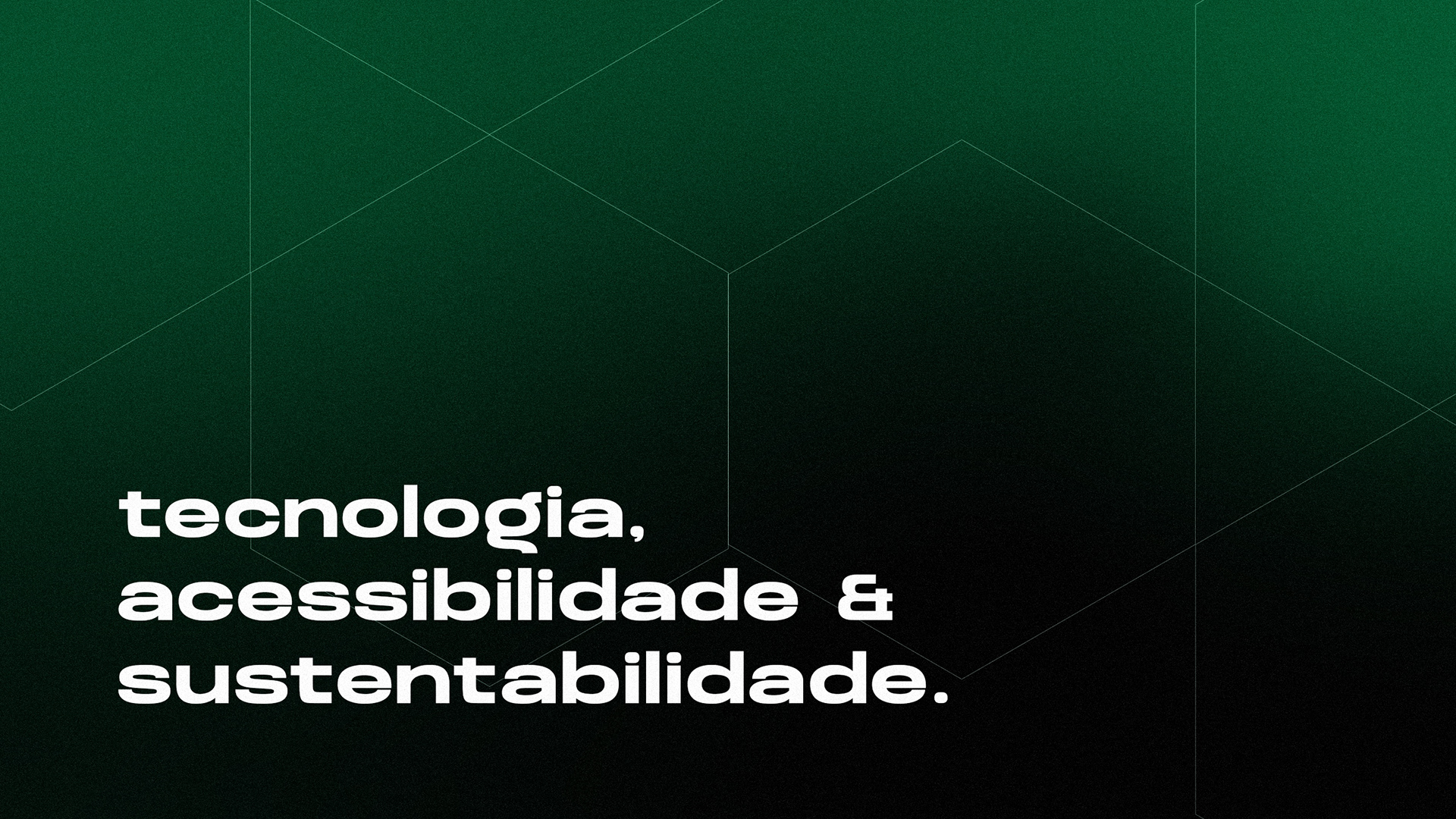
Além disso, a empresa visa ser referência em pesquisas e desenvolvimento de novas tecnologias, muito mais circulares e mais seguras para as pessoas e para a natureza.
A Hydor valoriza a ciência e engenharia em sua forma mais profunda, trazendo paixão para novas possibilidades e uma reeducação no mercado, acessibilizando tecnologias para novas empresas brasileiras e estrangeiras, gerando uma rede de mudanças global.
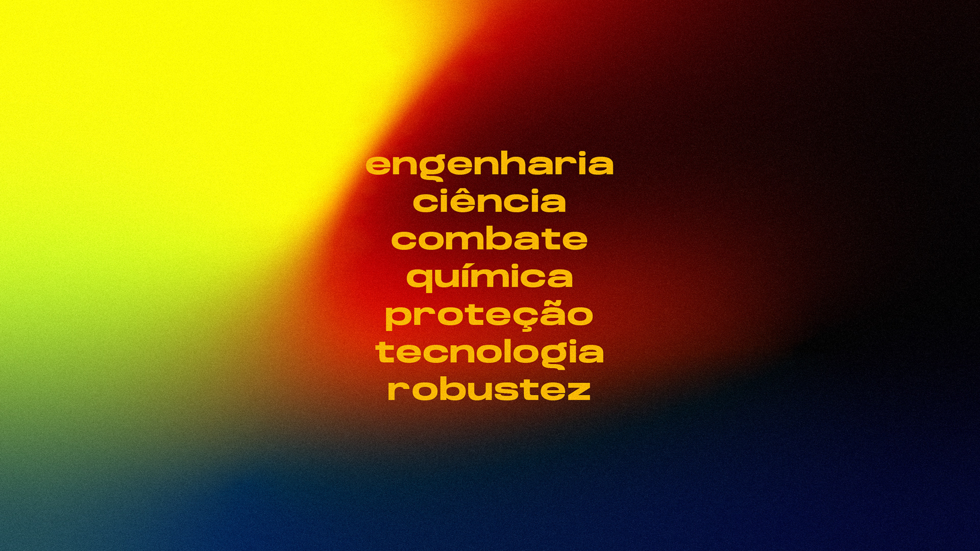
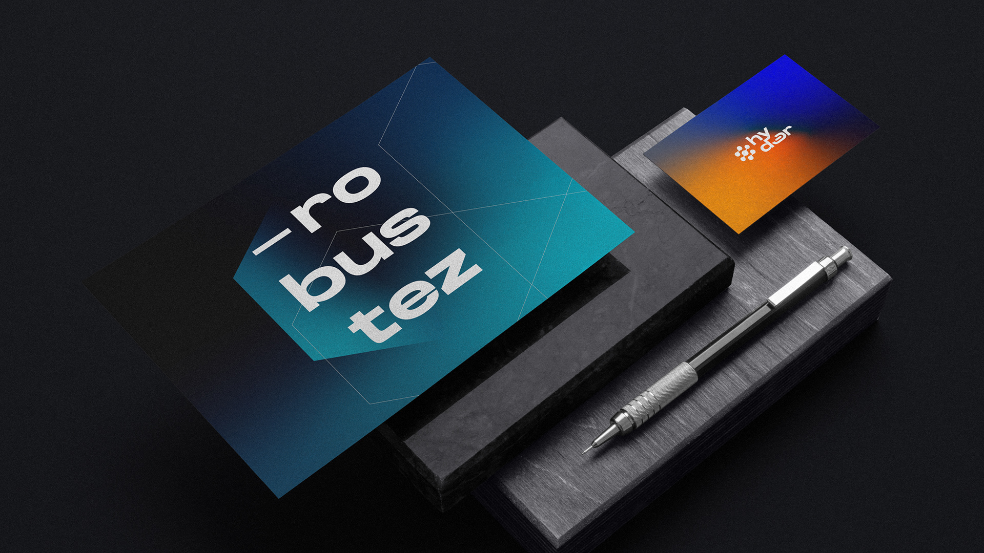
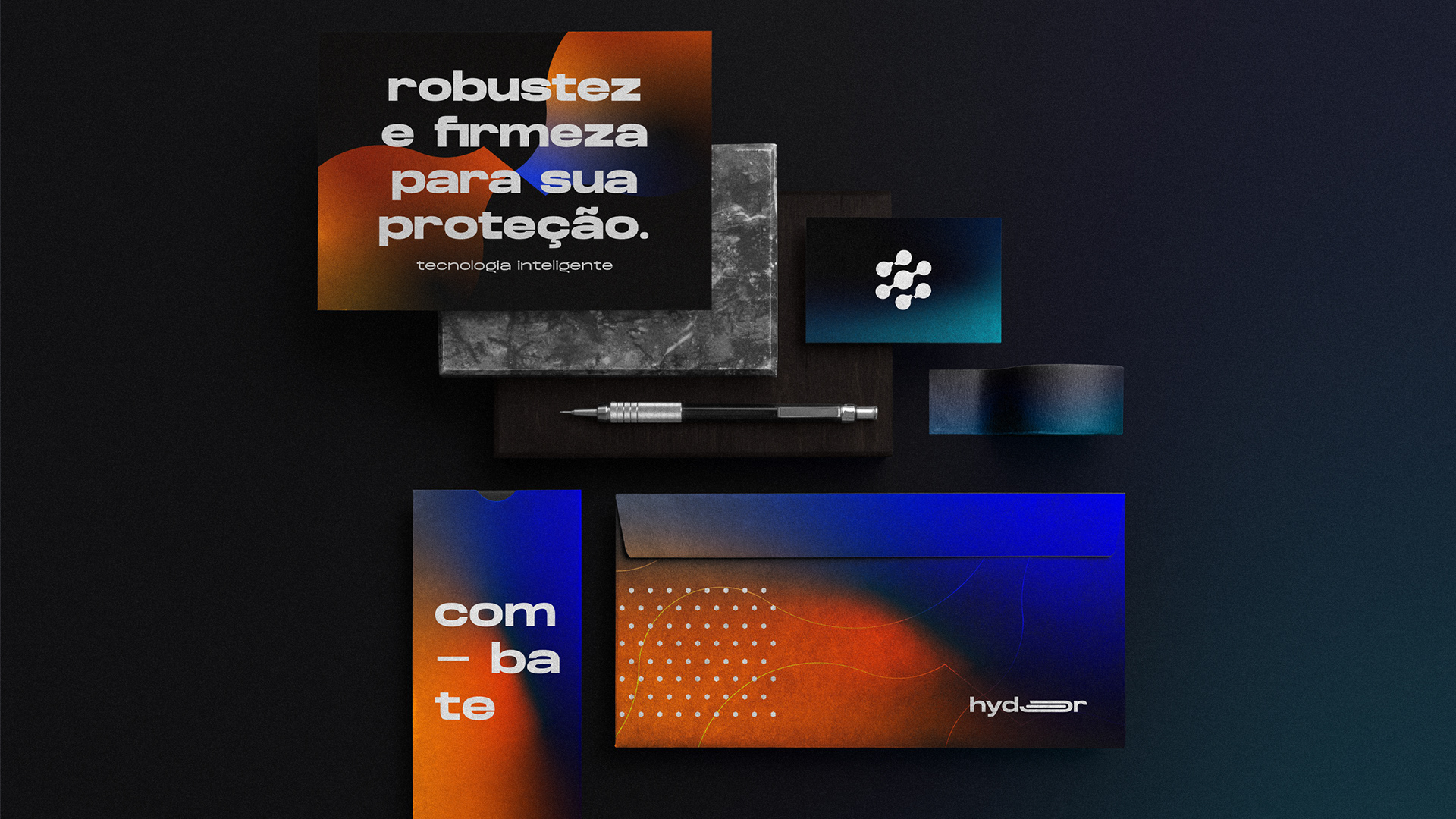
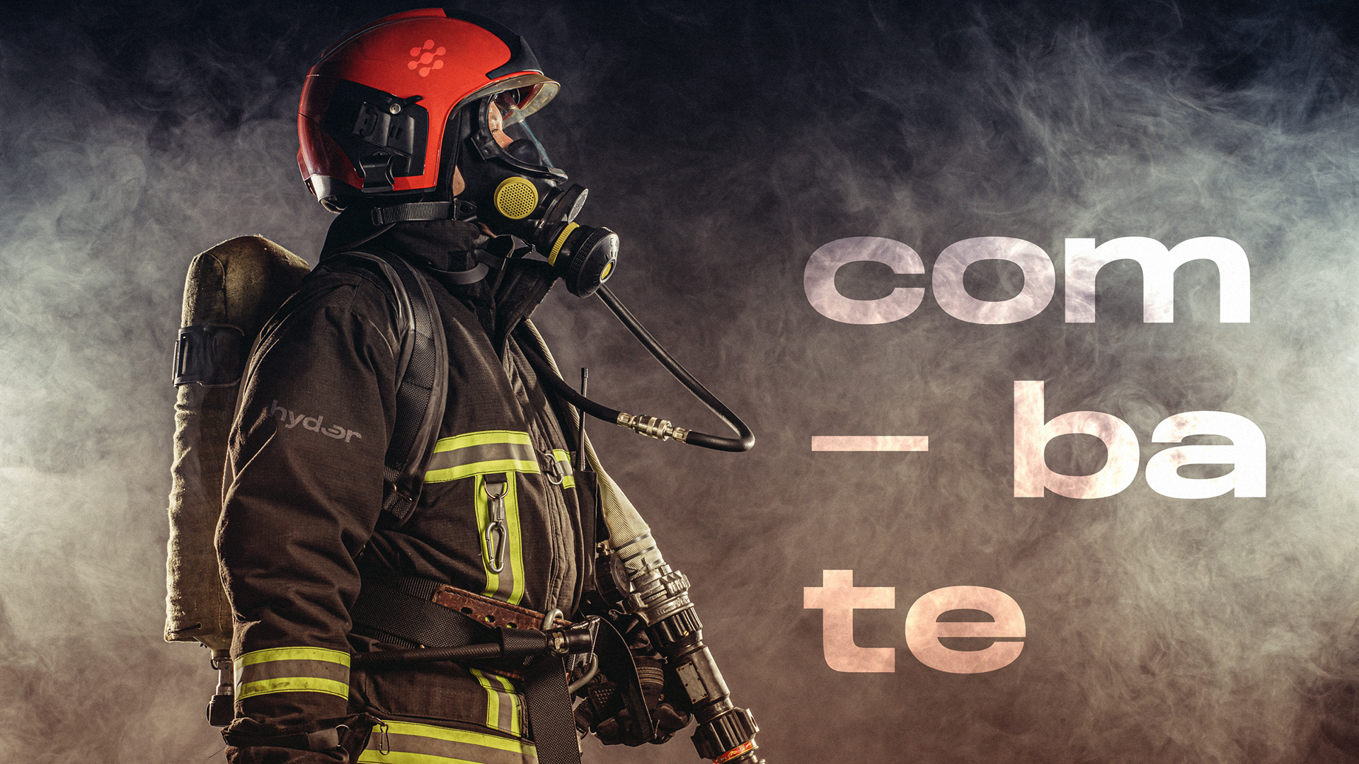
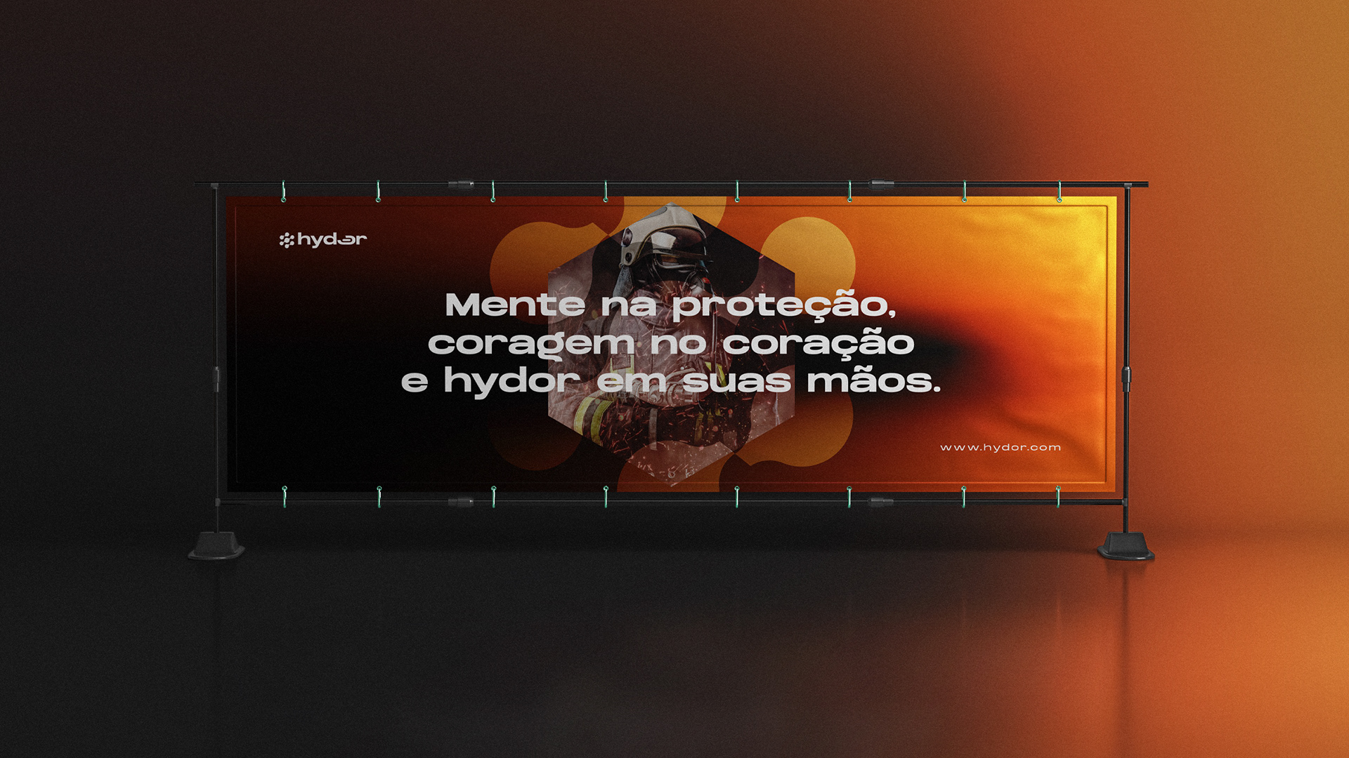
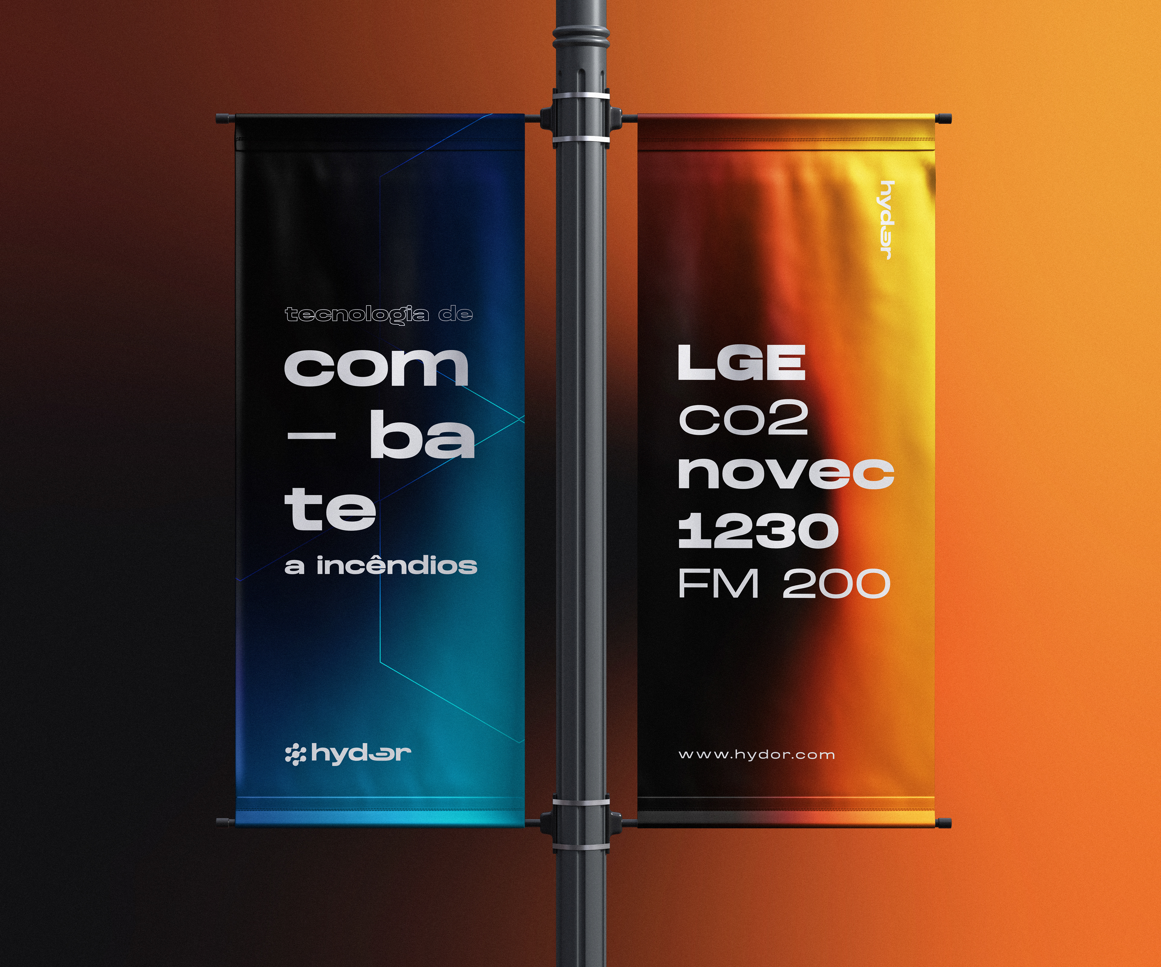
Robustez, combate, ciência, tecnologia, valorização nacional, inovação, acessibilidade, sustentabilidade e inteligência são as bases para os valores profundos da marca. Proteger a vida na terra a qualquer custo. Então como podemos tangibilizar a narrativa visual, verbal e emocional de uma forma diferenciadora?
En.
The brand project was developed for a new Brazilian company with innovation in fire suppression technologies, constantly seeking an intelligent differentiation from the old market giants, also bringing strong reverse logistics, appreciation of our natural resources and clean and non-harmful products. in its product range.
Hydor comes from ancient Greek ‘υδωρ and means water (phonetic ‘idór’). Hydor is the root of the word hydro (hydro), widely known in engineering and the root of more than 700 words in the Portuguese language, related to water.
Water is one of the most precious natural resources we have, due to its abundance not properly valued by humanity and highly wasted. Water is the source of life and the main extinguishing agent found in nature.
Water is one of the most precious natural resources we have, due to its abundance not properly valued by humanity and highly wasted. Water is the source of life and the main extinguishing agent found in nature.
In addition, the company aims to be a reference in research and development of new technologies, much more circular and safer for people and nature.
Hydor values science and engineering in its deepest form, bringing passion to new possibilities and a re-education in the market, making technologies accessible to new Brazilian and foreign companies, generating a network of global changes.
Robustness, combat, science, technology, national appreciation, innovation, accessibility, sustainability and intelligence are the foundations for the brand's deep values. Protect life on earth at any cost. So how can we make the visual, verbal and emotional narrative tangible in a differentiating way?
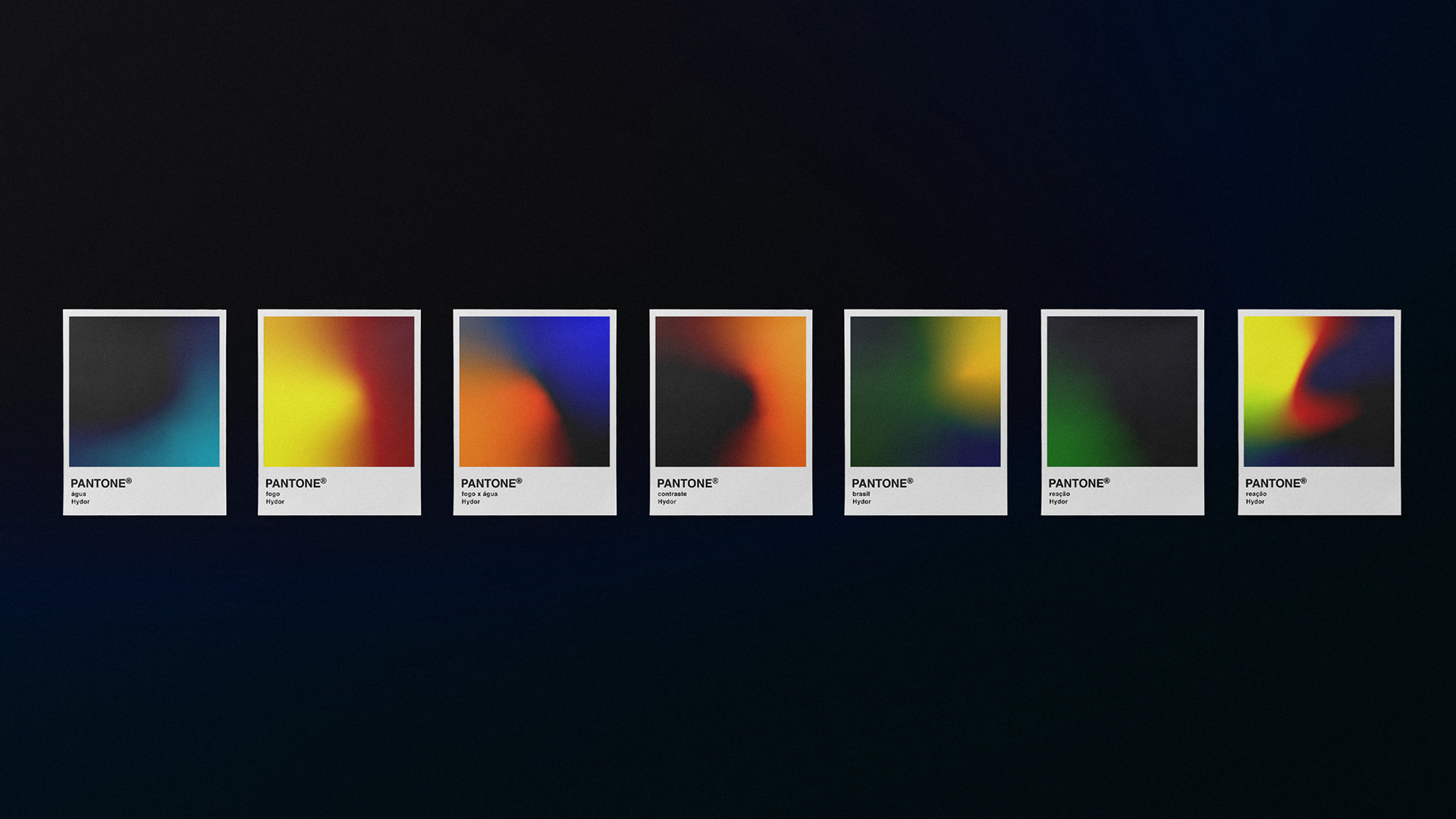
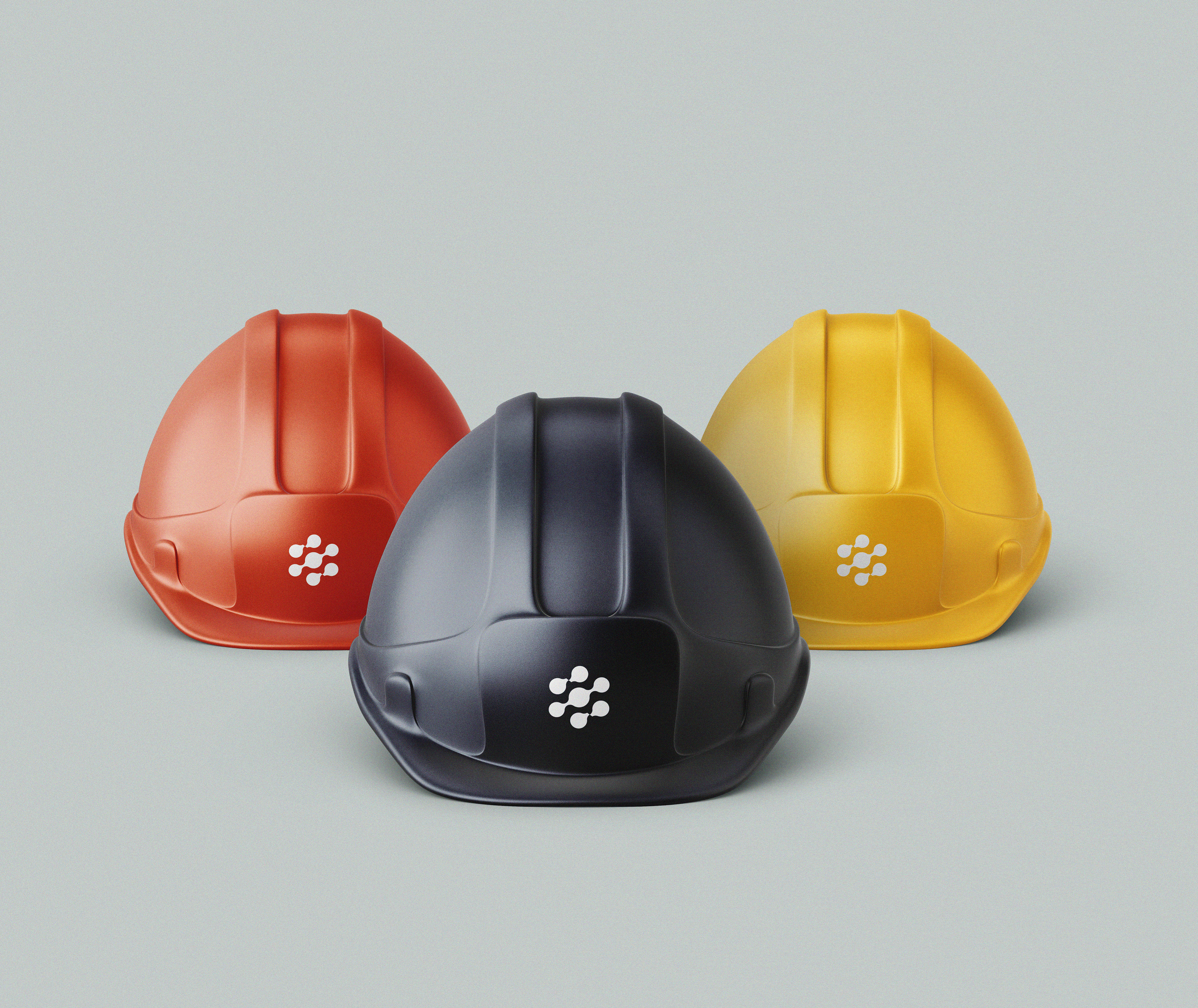
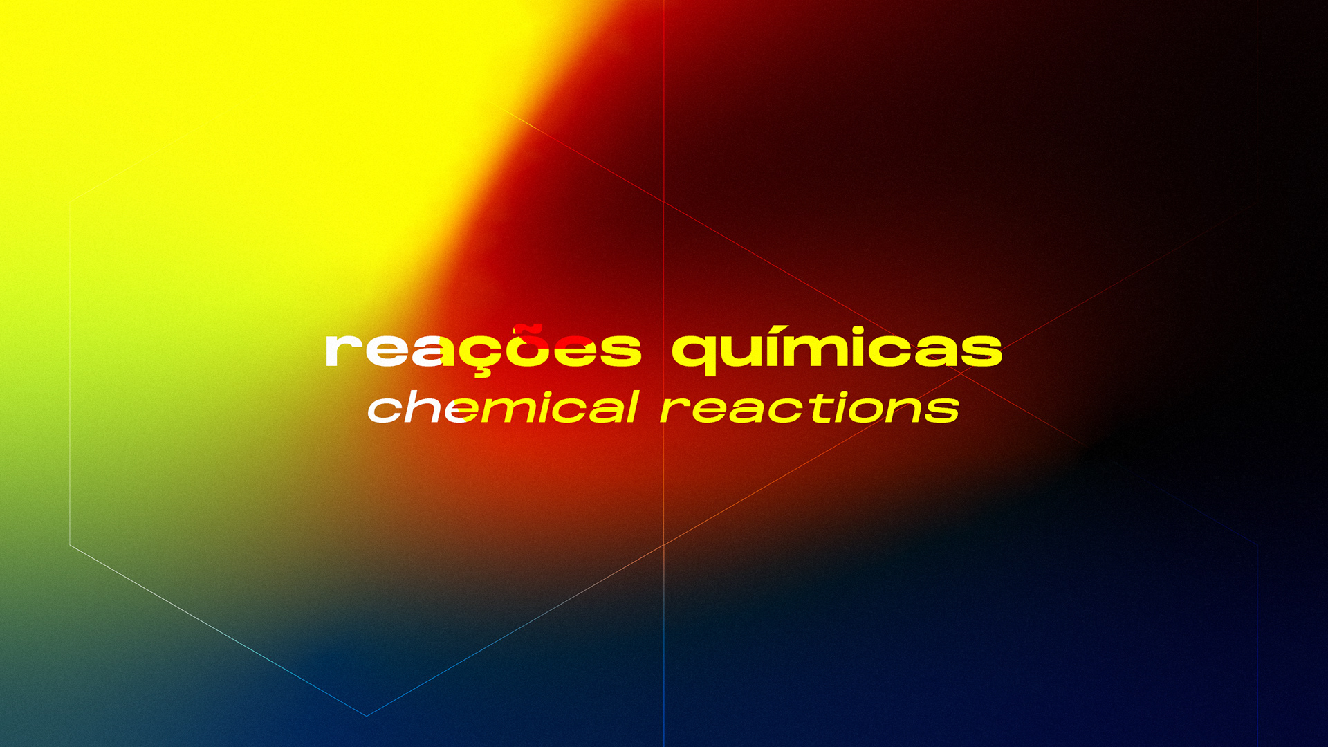
A paleta de cores da marca foi projetada pensando nos estados de matéria, reações químicas e diferenciação das concorrentes. E também projetada com acessibilidade para pessoas com problemas visuais. Através da ferramenta Adobe Color pudemos criar uma paleta sem conflitos de contraste, apropriada para daltônicos (com deuteranopia, protanopia e tritanopia).
-
The brand's color palette was designed thinking about the states of matter, chemical reactions and differentiation from competitors. And also designed with accessibility for people with visual problems. Using the Adobe Color tool, we were able to create a palette without contrast conflicts, suitable for colorblind (with deuteranopia, protanopia and tritanopia).
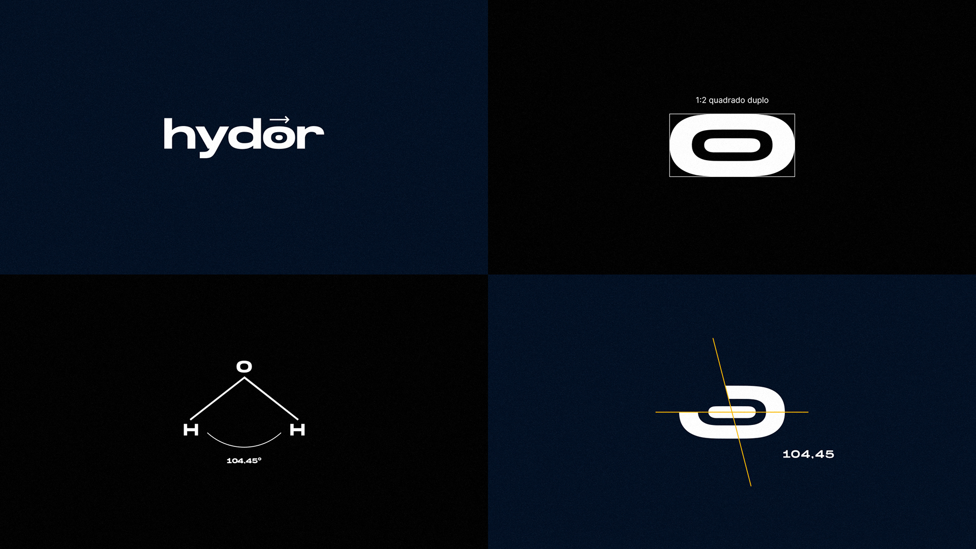
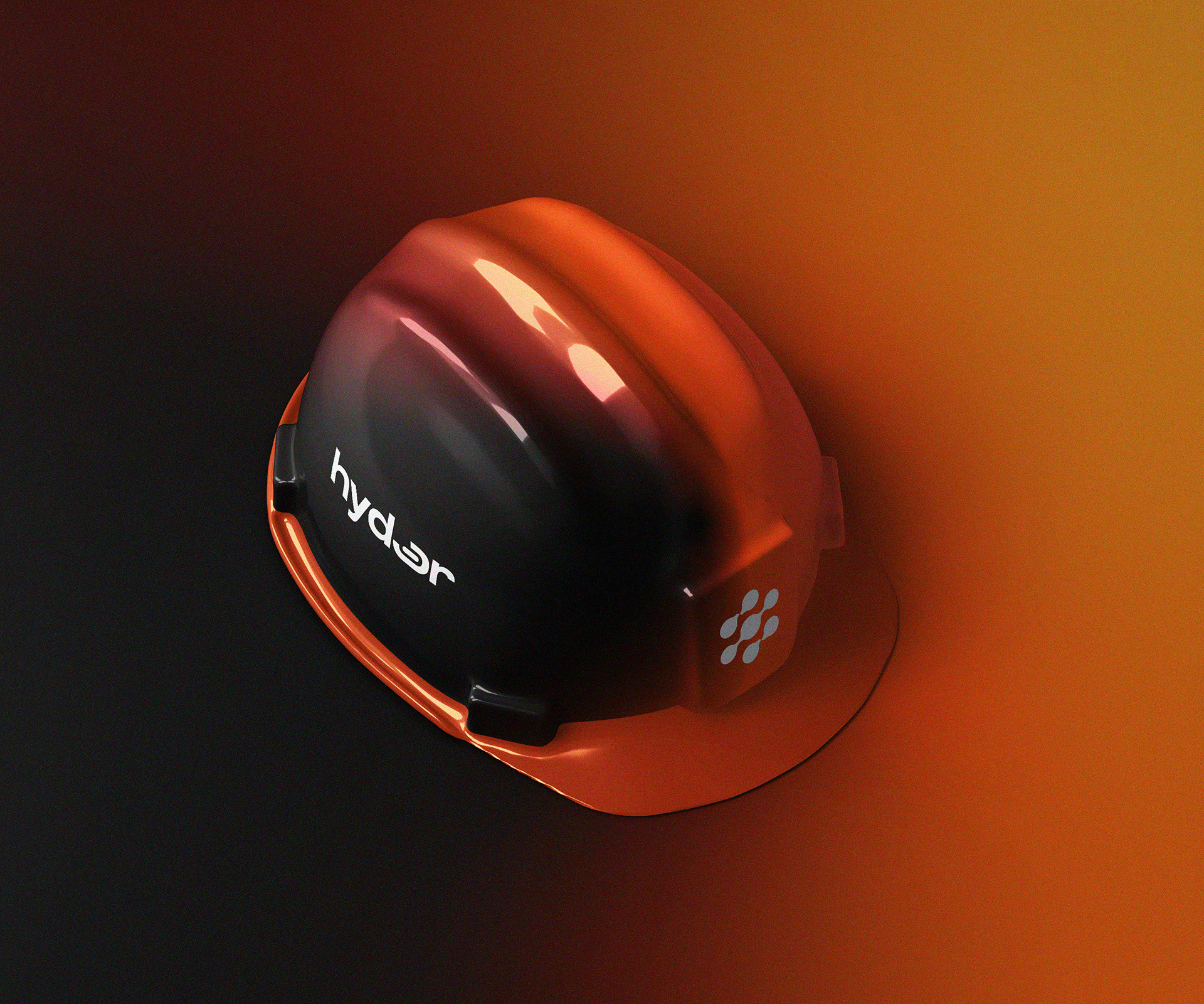
Robustez e peso eram atributos indispensáveis no logotipo. Trouxemos a ideia de expansão da proteção na letra "O", além do corte expressando a ideia do apagar do fogo, com um corte de 104.45°, que é o ângulo da molécula H2O.
-
Robustness and weight were indispensable attributes in the logo. We brought the idea of expanding protection in the letter "O", in addition to the cut expressing the idea of putting out the fire, with a cut of 104.45°, which is the angle of the H2O molecule.
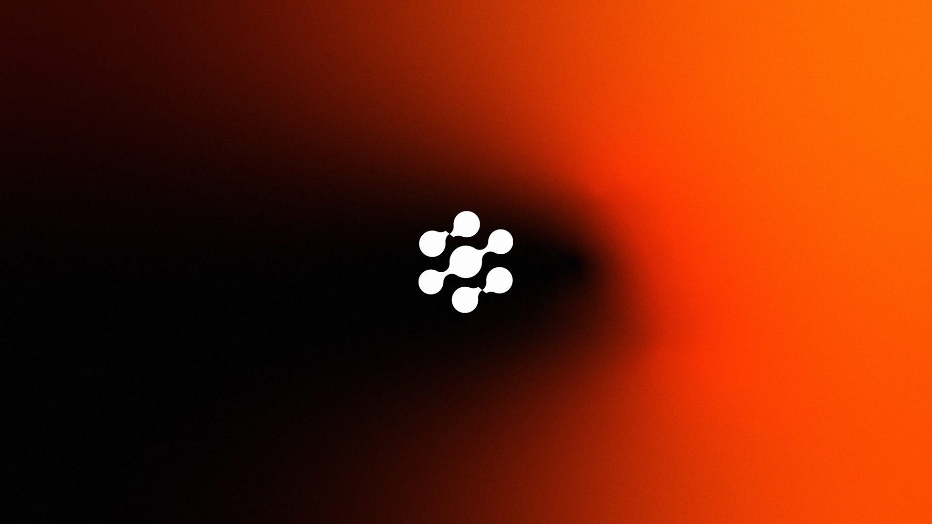
O desafio do símbolo era diferenciar de forma inteligente das concorrentes no mercado, com seus símbolos representados normalmente pela forma tradicional de uma chama ou de uma gota.
E como podemos unir o simples, inteligente, tecnológico, a ciência, proteção e impacto numa forma que represente o conceito em toda sua complexidade? A seguir, a explicação da construção do símbolo.
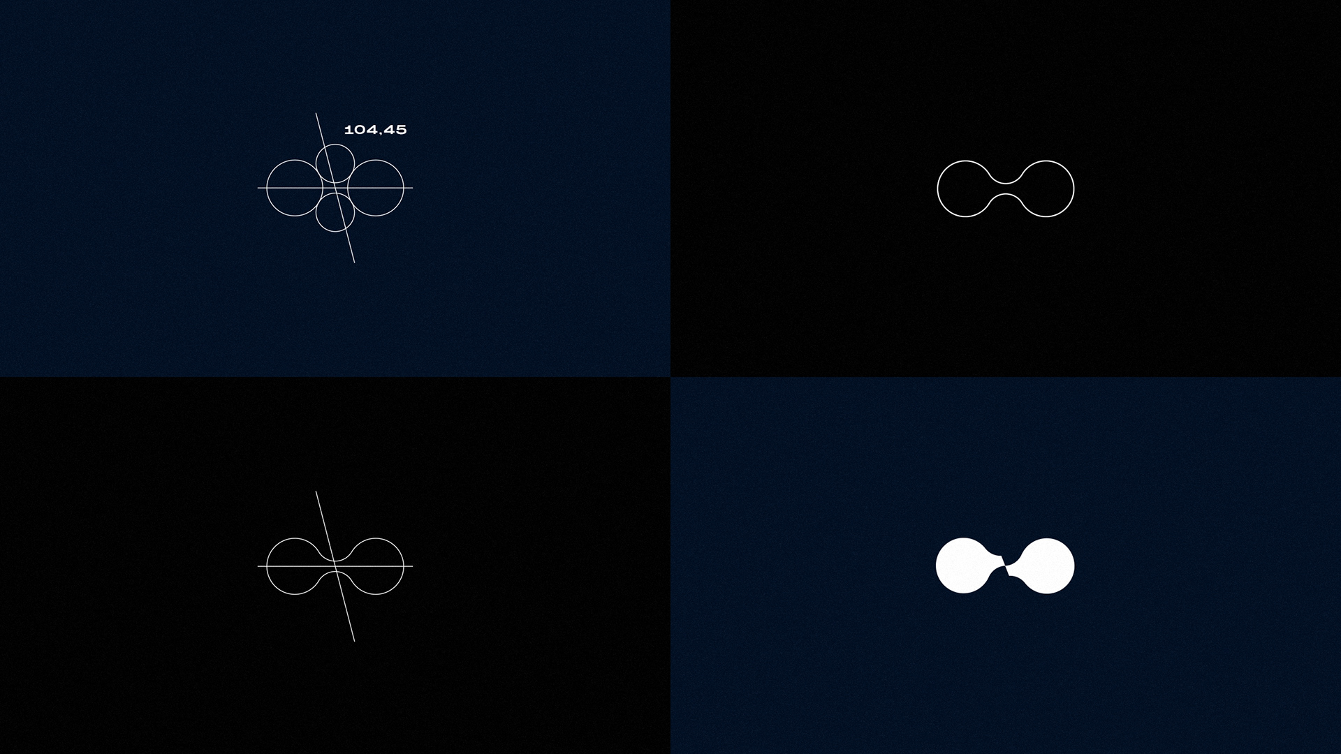
O2
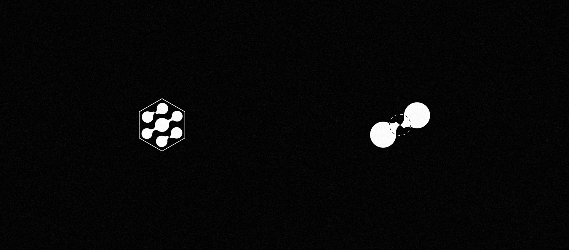
O comburente (oxigênio), é o elemento necessário para que haja fogo. A molécula O2 está representada abaixo.
Fizemos a quebra do oxigênio pelos agentes extintores (seja por retirada do combustível RMC, por resfriamento
ou por abafamento. Fazendo com que se extingua o fogo.
Usamos para a quebra o ângulo de 104,45 graus referente ao ângulo da molécula H2O.
The symbol's challenge was to intelligently differentiate from competitors in the market, with its symbols usually represented by the traditional shape of a flame or a droplet. And how can we unite the simple, intelligent, technological, science, protection and impact in a way that represents the concept in all its complexity? The explanation of the construction of the symbol follows.
O2
The oxidizer (oxygen) is the necessary element for there to be fire. The O2 molecule is represented below.
We broke the oxygen by the extinguishing agents (either by removing the RMC fuel, by cooling
or by smothering. Making the fire go out. For the break, we used the angle of 104.45 degrees referring to the angle of the H2O molecule.
H2O
A molécula de água referente ao nome da marca Hydor, principal agente extintor encontrado na natureza.
Ambas as moléculas utilizadas também fazem referência à tecnologia em suas formas.
-
H2O
The water molecule referring to the brand name Hydor, the main extinguishing agent found in nature.
Both molecules used also make reference to the technology in their forms.
The water molecule referring to the brand name Hydor, the main extinguishing agent found in nature.
Both molecules used also make reference to the technology in their forms.
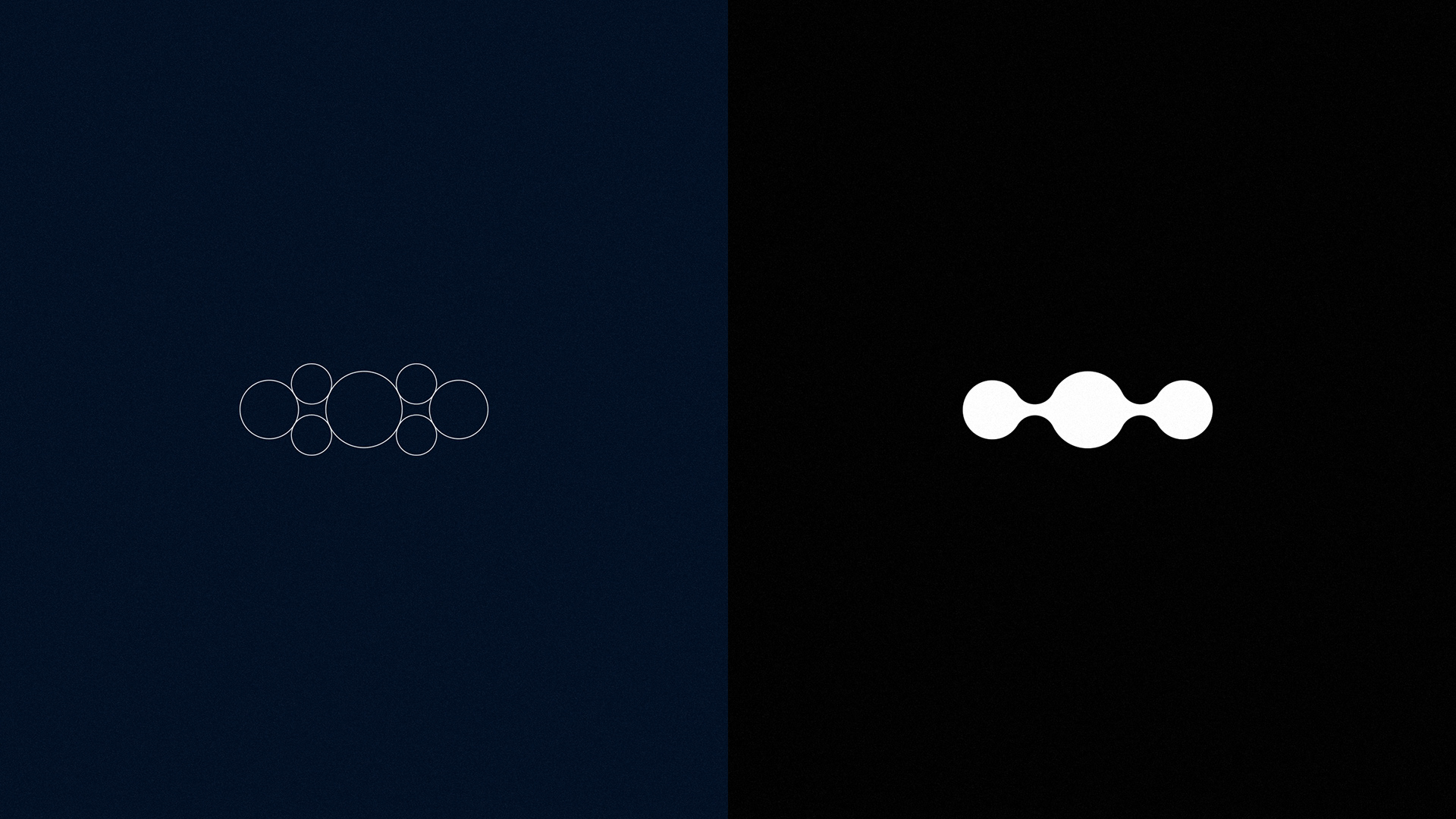
Temos a água no centro, entre as moléculas de O2 rompidas, carregando a ideia da água apagando o fogo, dando destaque como principal agente extintor da natureza, protagonizando o nome da marca.
-
We have water in the center, between the broken O2 molecules, carrying the idea of water putting out fire, highlighting the main extinguishing agent of nature, starring the brand name.
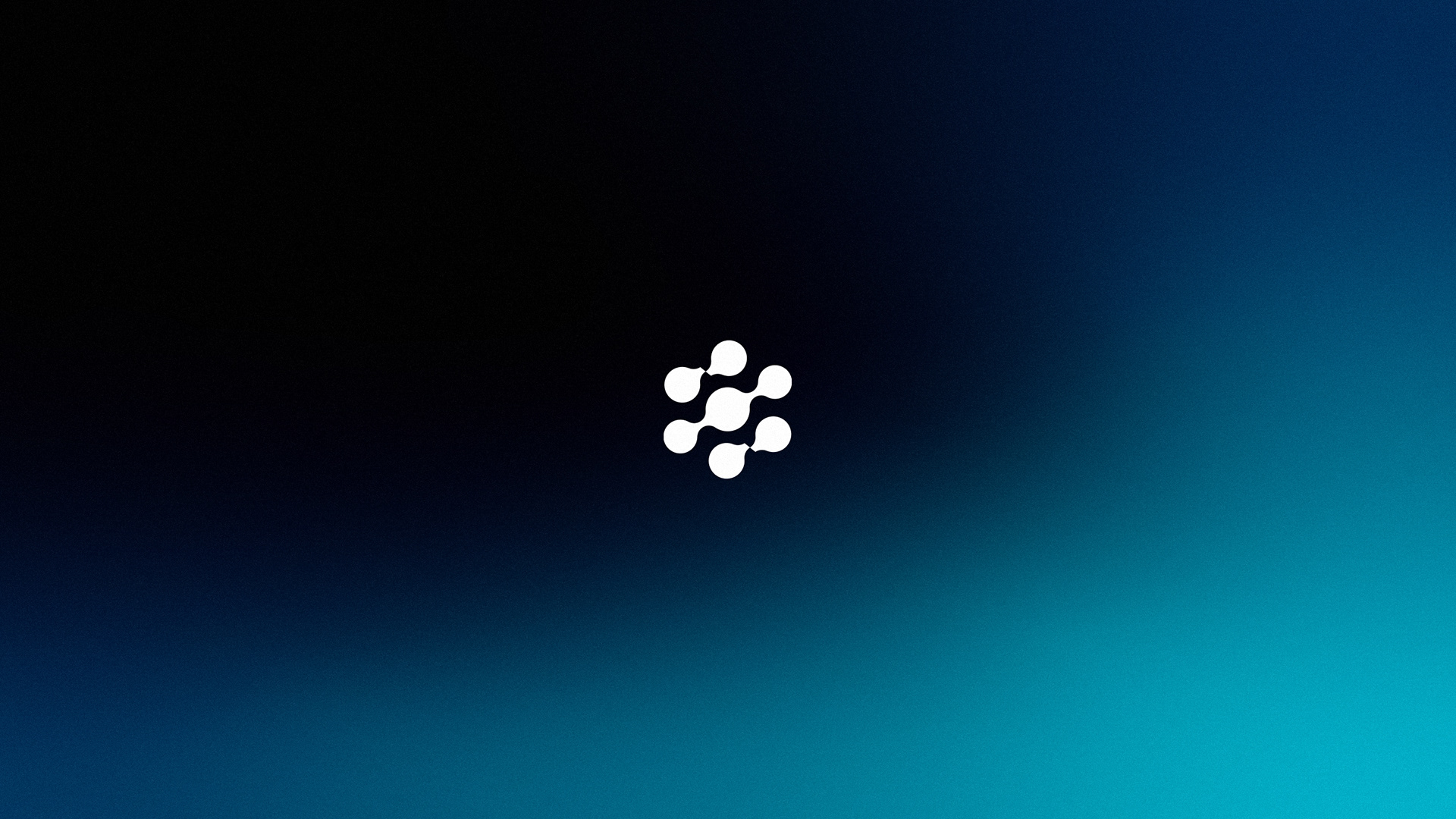
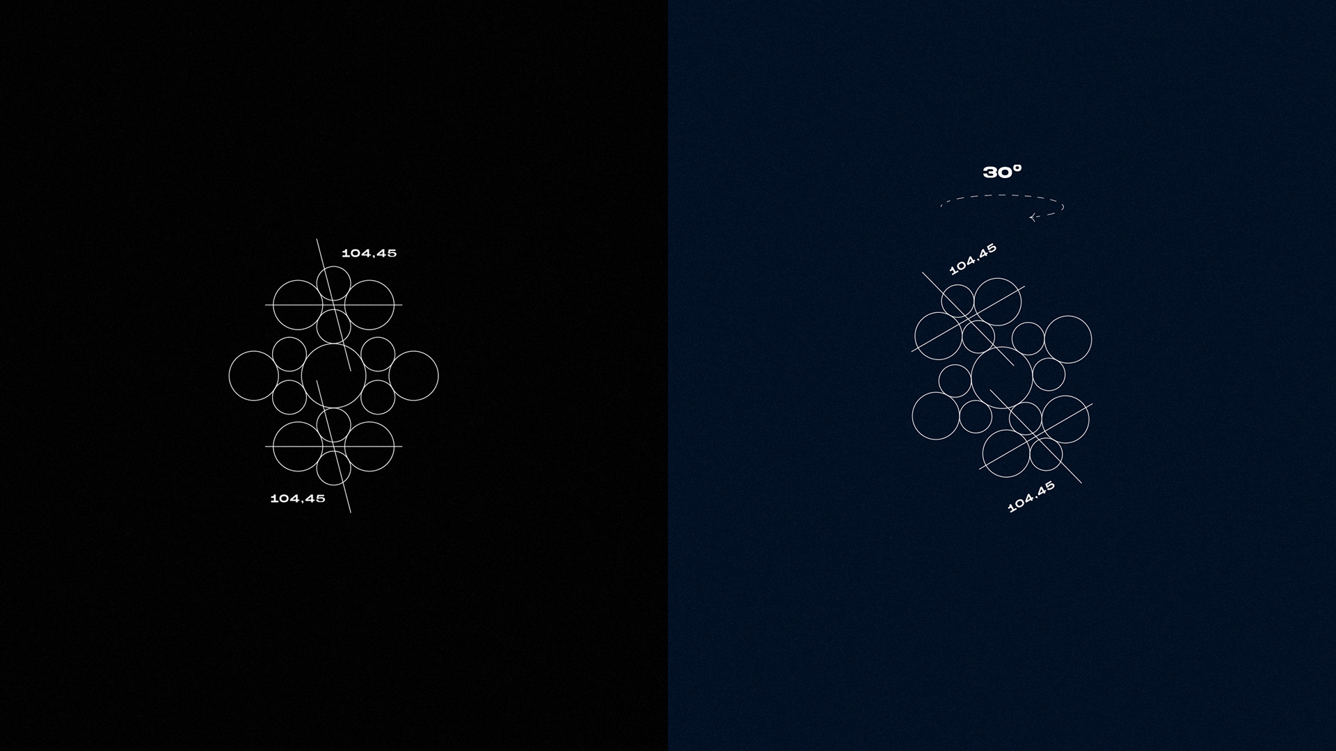
O hexágono é uma forma que é muito encontrada na natureza, das colmeias ao corpo humano. E isso ocorre pois o carbono está presente em tudo. Aqui o hexágono faz referência aos agentes extintores gasosos, à tecnologia.
Uma curiosidade também é que quando giramos a água em grande velocidade dentro de um recipiente o orifício interno assume a forma de um hexágono.
Na forma da molécula de oxigênio, a quebra também cria uma certa sensação de "tensão", referenciando a ideia do combate e combatente, o encontro água / fogo.
-The hexagon is a shape that is commonly found in nature, from beehives to the human body. And this is because carbon is present in everything. Here the hexagon refers to the gaseous extinguishing agents, to technology.
A curiosity is also that when we spin the water at high speed inside a container, the inner hole takes the shape of a hexagon.
A curiosity is also that when we spin the water at high speed inside a container, the inner hole takes the shape of a hexagon.
In the form of the oxygen molecule, the break also creates a certain feeling of "tension", referencing the idea of combat and combatant, the water/fire encounter.
Além disso, passamos também a ideia de proteção e segurança através da forma, com 6 formas em volta e 1 no centro.
Centramos no usuário, nos stakeholders, nas pessoas, nos recursos, na proteção. Também a ideia de trabalhar em conjunto, coletivamente e colaborativamente por um bem maior.
-
In addition, we also pass on the idea of protection and security through the shape, with 6 shapes around it and 1 in the center.
We focus on the user, stakeholders, people, resources, protection. Also the idea of working together, collectively and collaboratively for a greater good.
We focus on the user, stakeholders, people, resources, protection. Also the idea of working together, collectively and collaboratively for a greater good.